Grid for Angular
Angular standalone version of this topic (compatible with Angular 17+). Import both the Smart UI component and module in the standalone component.
What this topic covers: practical setup, the framework-specific API access pattern, and copy-adapt guidance for the examples in this page.
import { Component, ViewChild, ViewEncapsulation } from '@angular/core';
import { CommonModule } from '@angular/common';
import { RouterOutlet } from '@angular/router';
import { GridComponent, GridModule } from 'smart-webcomponents-angular/grid';

@Component({
  selector: 'app-root',
  standalone: true,
  imports: [CommonModule, GridModule, RouterOutlet],
  templateUrl: './app.component.html',
  styleUrls: ['./app.component.css'],
  encapsulation: ViewEncapsulation.None
})
export class AppComponent {
  @ViewChild('grid', { read: GridComponent, static: false }) grid!: GridComponent;
}
<!-- app.component.html -->
<smart-grid #grid></smart-grid>
Use this.grid for API methods in this topic.
Build your web apps using Smart UI
Smart.Grid - Grouping
Grid Grouping
Grouping by one or multiple columns(data fields) is supported by Smart.Grid.
Grouping is configured via the property/object grouping. To enable it, set grouping.enabled to true.
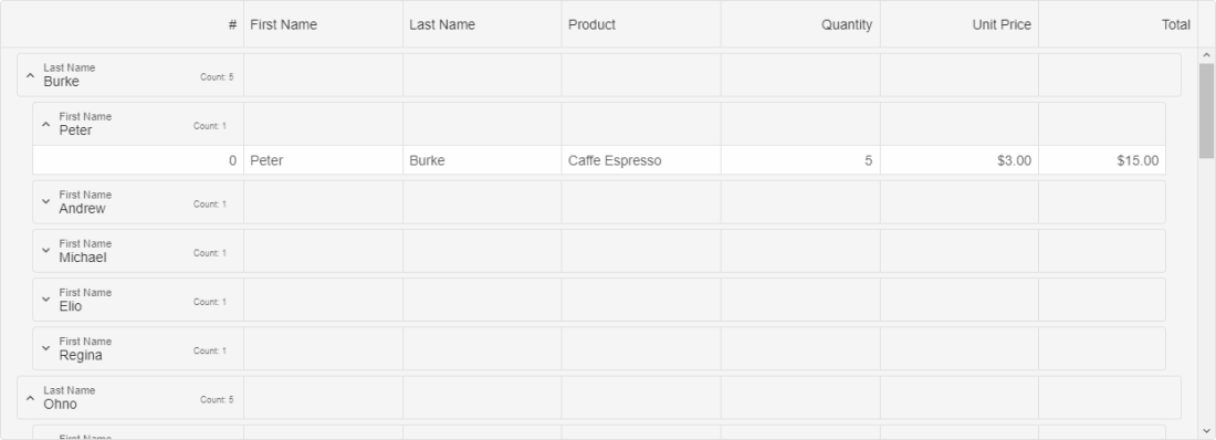
Once the Grid is grouped by a column, group rows appear with information about the group name, group data field, and the count of rows in the group. Lower-level group rows have indentation that represents group hierarchy.
Additional settings of the grouping object that control grouping behavior are:
- allowCollapse - enables collapsing of groups.
- autoExpandAll - automatically expands all groups.
- expandMode - sets whether a group is expanded on 'buttonClick' or 'rowClick'.
- groupRowHeight - sets the group row height.
- toggleButtonIndent - sets the indent of the group toggle button (arrow).
- groupIndent - sets the indent of the group.
Theare are three ways to apply grouping to the Grid:
Whether or not a column can be grouped can be set via the property allowGroup applied to the column's respective object.
More information: property grouping in the Grid API documentation.
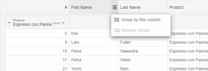
Group Menu
Grouping through the UI can be done through the group menu (part of the column menu). The group menu can be opened by clicking the menu button in a column's header and offsers the option to either group by a column or remove grouping (whichever is applicable):
Grouping through the dataSource Object
An initial grouping can be applied by setting groupBy in the dataSource object to an array of data fields (columns to group by), e.g.:
dataSource: new Smart.DataAdapter({
    dataSource: generateData(100),
    groupBy: ['firstName', 'lastName'],
    dataFields: [
        'id: number',
        'firstName: string',
        'lastName: string',
        'productName: string',
        'quantity: number',
        'price: number',
        'total: number'
    ]
}),
Grouping-related Methods:
- addGroup - adds a group.
- removeGroup - removes a group.
- clearGroups - clears all groups.
- collapseRow - collapses a Grouping row.
- collapseAllRows - collapses all Grouping rows.
- expandRow - expands a Grouping row.
- expandAllRows - expands all Grouping rows.
For AI tooling
Developer Quick Reference
Topic: grid-grouping Component: Grid Framework: Angular
Main methods: (none detected)
Common config keys: dataSource
Implementation Notes
Compatibility: Angular 17+ (standalone) API access pattern: @ViewChild(...) + this.component.method()
Lifecycle guidance: Bind inputs declaratively and call imperative API through @ViewChild in/after ngAfterViewInit.
Common pitfalls:
- Using @ViewChild API too early (before view init).
- Omitting standalone imports for Smart modules in @Component.imports.
- Type mismatches between configuration fields and template bindings.
Validation checklist:
- Ensure module import exists in standalone component imports array.
- Use typed @ViewChild(..., { read: ComponentType }).
- Call imperative methods after view initialization.