Grid for React
React version of this topic (compatible with React 19+). Keep the same configuration logic from JavaScript and pass it as component props.
What this topic covers: practical setup, the framework-specific API access pattern, and copy-adapt guidance for the examples in this page.
import React, { useMemo, useRef } from 'react';
import { Grid } from 'smart-webcomponents-react/grid';
import 'smart-webcomponents-react/source/styles/smart.default.css';

export default function App() {
  const componentRef = useRef(null);
  const componentProps = useMemo(() => ({
    // Copy this topic's JavaScript configuration here.
  }), []);

  return <Grid ref={componentRef} {...componentProps}></Grid>;
}
Use componentRef.current for API methods in this topic.
Build your web apps using Smart UI
Smart.Grid - Nested Grids
Nested Grids
Smart.Grid can display nested grids by using the Row Detail functionality. When enabled, by expanding a Grid row, a Nested Grid is displayed showing additional details about the respective data. That is achieved by setting rowDetail.enabled to true and implementing the onRowDetailInit callback function.
Additional settings available in the rowDetail object are:
- height - sets the height of the row details.
- position - sets the position of the Column which allows you to dynamically expand/collapse the row details - 'near' (left) or 'far' (right).
- template - sets the template of the row details.
- visible - sets the visibility of the column which allows you to dynamically expand/collapse the row details.
- dialog - sets the row details dialog. Described in detail in the section Nested Grids in Dialog in this article.
More information: property rowDetail in the Grid API documentation.
The onRowDetailInit callback function is called when a row detail is initializing and allows for a initial per-row modification of the row detail template. The nested grid is configured and initialized in this function. The onRowDetailUpdated callback function is called when a row detail is udpating and allows for a additional modifications of the row detail.
More information: property onRowDetailInit in the Grid API documentation.
More information: property onrowdetailupdated in the Grid API documentation.
onRowDetailInit(index, row, detail) {
    const grid = document.createElement('div');

    detail.appendChild(grid);

    const gridInstance = new Smart.Grid(grid, {
        dataSource: new Smart.DataAdapter({
            dataSource: getCountriesData().filter(data => data.ID === row.data.ID),
            dataFields: [
                'ID: number',
                'Country: string',
                'Area: number',
                'Population_Urban: number',
                'Population_Rural: number',
                'Population_Total: number',
                'GDP_Agriculture: number',
                'GDP_Industry: number',
                'GDP_Services: number',
                'GDP_Total: number'
            ]
        }),
        columns: [
            'Population_Urban',
            'Population_Rural',
            'Population_Total',
            'GDP_Total'
        ]
    });
},
rowDetail: {
    enabled: true,
    visible: true,
    height: 120
}
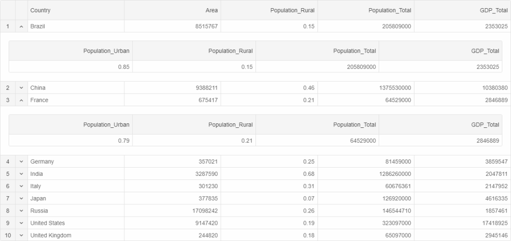
Nested Grids can be shown by pressing the toggle arrow in the row details column or by setting showDetail to true in a row's respective object. The height and template of a particular row's detail can be modified by setting detailHeight and detailTemplate respectively.
Row details can display any information and are not limited to just nested Grids.
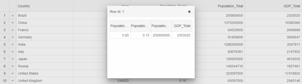
Nested Grids in Dialog
If rowDetail.dialog.enabled is set to true, nested Grids are displayed in a separate pop-up dialog. Additional settings part of the rowDetail.dialog object that allow configuring this dialog are:
- header - sets the header of the dialog.
- height - sets the height of the dialog.
- width - sets the width of the dialog.
- left - sets the left position of the dialog.
- top - sets the top position of the dialog.
Row Detail-related Methods:
- showDetail - shows the details of a Row.
- hideDetail - hides the details of a Row.
For AI tooling
Developer Quick Reference
Topic: grid-nested-grids Component: Grid Framework: React
Main methods: (none detected)
Common config keys: dataSource, columns
Implementation Notes
Compatibility: React 19+ API access pattern: const componentRef = useRef(null) + componentRef.current.method()
Lifecycle guidance: Use useMemo for large config objects and call imperative API through componentRef.current after first render.
Common pitfalls:
- Recreating columns/dataSource objects on every render can reset component state.
- Calling API methods before ref is available causes runtime errors.
- Mixing controlled and imperative updates without sync can lead to stale UI.
Validation checklist:
- Keep config objects memoized when possible.
- Guard API calls with ref existence checks.
- Verify CSS theme import is present once per app.