Grid for React
React version of this topic (compatible with React 19+). Keep the same configuration logic from JavaScript and pass it as component props.
What this topic covers: Focuses on page size, navigation behavior, and state expectations so users can browse large datasets with consistent performance.
import React, { useMemo, useRef } from 'react';
import { Grid } from 'smart-webcomponents-react/grid';
import 'smart-webcomponents-react/source/styles/smart.default.css';

export default function App() {
  const componentRef = useRef(null);
  const componentProps = useMemo(() => ({
    // Copy this topic's JavaScript configuration here.
  }), []);

  return <Grid ref={componentRef} {...componentProps}></Grid>;
}
Use componentRef.current for API methods in this topic.
Build your web apps using Smart UI
Smart.Grid - Paging
Grid Paging
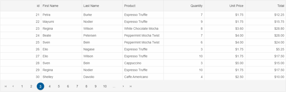
Pagination can be enabled in Smart.Grid in order to view large data sets page by page and navigate through them easily.
Pagination is configured via two properties/objects: paging and pager.
To enable paging, set paging.enabled to true.
The number of Grid rows per page can be set via paging.pageSize. The default number is 10. The current page index can be get or set by accessing paging.pageIndex.
Once pages are set up, they can be navigated in two ways:
More information: property paging in the Grid API documentation.
Pager
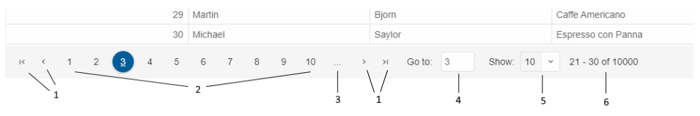
Pager is a user interface component that allows for easy navigation of Grid pages and customization of paging settings. The pager part of Smart.Grid is an instance of Smart.Pager (<smart-pager>)
To enable the pager, set pager.visible to true.
Parts of the pager:
- Navigation buttons
- Page index selectors
- Auto ellipsis
- Navigation input
- Page size selector
- Summary
Additional settings of the pager object that control these parts are:
- autoEllipsis - sets the ellipsis display mode.
- position - sets the position of pager - 'near' (above rows), 'far' (below rows), or 'both'.
- template - sets a template for the pager.
- pageSizeSelector - describes the settings for the 'rows per page' option.
- summary - describes the summary settings.
- navigationButtons - describes the navigation buttons settings.
- navigationInput - describes the settings about navigation input option.
- pageIndexSelectors - describes the settings for the numeric page buttons.
More information: property pager in the Grid API documentation.
Spinner
An alternative to the pager is the spinner, which can be enabled by setting paging.spinner.enabled to true. The spinner appears as a pair of arrows above the Grid's scrollbar. Pressing the arrows navigates through Grid pages.
The property paging.spinner.step determines the number of pages to navigate via the spinner.
For AI tooling
Developer Quick Reference
Topic: grid-paging Component: Grid Framework: React
Main methods: (none detected)
Common config keys: pager
Implementation Notes
Compatibility: React 19+ API access pattern: const componentRef = useRef(null) + componentRef.current.method()
Lifecycle guidance: Use useMemo for large config objects and call imperative API through componentRef.current after first render.
Common pitfalls:
- Recreating columns/dataSource objects on every render can reset component state.
- Calling API methods before ref is available causes runtime errors.
- Mixing controlled and imperative updates without sync can lead to stale UI.
Validation checklist:
- Keep config objects memoized when possible.
- Guard API calls with ref existence checks.
- Verify CSS theme import is present once per app.