Grid for Angular
Angular standalone version of this topic (compatible with Angular 17+). Import both the Smart UI component and module in the standalone component.
What this topic covers: practical setup, the framework-specific API access pattern, and copy-adapt guidance for the examples in this page.
import { Component, ViewChild, ViewEncapsulation } from '@angular/core';
import { CommonModule } from '@angular/common';
import { RouterOutlet } from '@angular/router';
import { GridComponent, GridModule } from 'smart-webcomponents-angular/grid';

@Component({
  selector: 'app-root',
  standalone: true,
  imports: [CommonModule, GridModule, RouterOutlet],
  templateUrl: './app.component.html',
  styleUrls: ['./app.component.css'],
  encapsulation: ViewEncapsulation.None
})
export class AppComponent {
  @ViewChild('grid', { read: GridComponent, static: false }) grid!: GridComponent;
}
<!-- app.component.html -->
<smart-grid #grid></smart-grid>
Use this.grid for API methods in this topic.
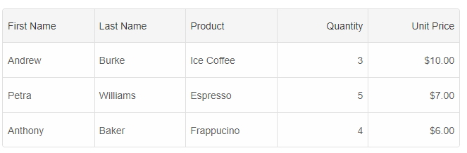
Grid Row Height
By default the Grid displays all rows with a height of 30px. It is defined by the --smart-grid-row-height CSS variable i.e you can change the row height by setting a new value to this variable. It is possible to change the row height by setting thelayout.rowHeight property, too.
Example:
componentProps = {
    dataSourceSettings: {
        dataFields: [
            { name: 'firstName', dataType: 'string' },
            { name: 'lastName', dataType: 'string' },
            { name: 'productName', map: 'product.name', dataType: 'string' },
            { name: 'quantity', map: 'product.quantity', dataType: 'number' },
            { name: 'price', map: 'product.price', dataType: 'number' },
            { name: 'total', map: 'product.total', dataType: 'number' }
        ]
    },
    behavior: {
        columnResizeMode: 'growAndShrink'
    },
    sorting: {
        enabled: true
    },
    dataSource: [
        {
            firstName: 'Andrew',
            lastName: 'Burke',
            product: {
                name: 'Ice Coffee', price: 10, quantity: 3, total: 30
            }
        },
        {
            firstName: 'Petra',
            lastName: 'Williams',
            product: {
                name: 'Espresso', price: 7, quantity: 5, total: 35
            }
        },
        {
            firstName: 'Anthony',
            lastName: 'Baker',
            product: {
                name: 'Frappucino', price: 6, quantity: 4, total: 24
            }
        }
    ],
    layout: {
        rowHeight: 50
    },
    columns: [
        {
            label: 'First Name', dataField: 'firstName', cellsVerticalAlign: 'center'
        },
        { label: 'Last Name', dataField: 'lastName' },
        { label: 'Product', dataField: 'productName' },
        {
            label: 'Quantity', dataField: 'quantity', cellsAlign: 'right'
        },
        { label: 'Unit Price', dataField: 'price', cellsAlign: 'right', cellsFormat: 'c2' }
    ]
}
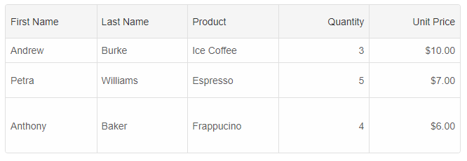
Custom Row Height
Each row may have a different row height. You can use therow.height property to set a new height to the row. In the following example, we will show
how to set a row height, during the row initialization process.
componentProps = {
    dataSourceSettings: {
        dataFields: [
            { name: 'firstName', dataType: 'string' },
            { name: 'lastName', dataType: 'string' },
            { name: 'productName', map: 'product.name', dataType: 'string' },
            { name: 'quantity', map: 'product.quantity', dataType: 'number' },
            { name: 'price', map: 'product.price', dataType: 'number' },
            { name: 'total', map: 'product.total', dataType: 'number' }
        ]
    },
    behavior: {
        columnResizeMode: 'growAndShrink'
    },
    sorting: {
        enabled: true
    },
    dataSource: [
        {
            firstName: 'Andrew',
            lastName: 'Burke',
            product: {
                name: 'Ice Coffee', price: 10, quantity: 3, total: 30
            }
        },
        {
            firstName: 'Petra',
            lastName: 'Williams',
            product: {
                name: 'Espresso', price: 7, quantity: 5, total: 35
            }
        },
        {
            firstName: 'Anthony',
            lastName: 'Baker',
            product: {
                name: 'Frappucino', price: 6, quantity: 4, total: 24
            }
        }
    ],
    onRowInit: (index, row) => {
        if (index === 0) {
            row.height = 35;
        }
        else if (index === 1) {
            row.height = 50;
        }
        else if (index === 2) {
            row.height = 80;
        }
        else row.height = 50;
    },
    columns: [
        {
            label: 'First Name', dataField: 'firstName', cellsVerticalAlign: 'center'
        },
        { label: 'Last Name', dataField: 'lastName' },
        { label: 'Product', dataField: 'productName' },
        {
            label: 'Quantity', dataField: 'quantity', cellsAlign: 'right'
        },
        { label: 'Unit Price', dataField: 'price', cellsAlign: 'right', cellsFormat: 'c2' }
    ]
}
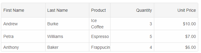
Cells Text Wrapping and auto row height
By setting the layout.rowHeight property to 'auto' and layout.allowCellsWrap property to true, the text inside rows will wrap and the rows will auto-resize.
	layout: {
        allowCellsWrap: true,
        rowHeight: 'auto'
    }
Row Resize
To enable row resize, you will need to set the behavior.rowResizeMode to 'growAndShrink' or 'split' and the appearance.showRowHeader property to true.For AI tooling
Developer Quick Reference
Topic: grid-row-resize Component: Grid Framework: Angular
Main methods: (none detected)
Common config keys: behavior, sorting, dataSource, layout, columns
Implementation Notes
Compatibility: Angular 17+ (standalone) API access pattern: @ViewChild(...) + this.component.method()
Lifecycle guidance: Bind inputs declaratively and call imperative API through @ViewChild in/after ngAfterViewInit.
Common pitfalls:
- Using @ViewChild API too early (before view init).
- Omitting standalone imports for Smart modules in @Component.imports.
- Type mismatches between configuration fields and template bindings.
Validation checklist:
- Ensure module import exists in standalone component imports array.
- Use typed @ViewChild(..., { read: ComponentType }).
- Call imperative methods after view initialization.