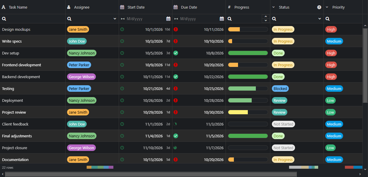
Getting Started with React Grid Component
Smart UI React targets React 18+ and current Node LTS for tooling; use TypeScript templates when you want typed props and events.
Demo source (Smart UI repo): react/source/grid/overview/App.jsx
1 Create a Vite + React + TypeScript app
npm create vite@latest my-smart-app -- --template react-ts
cd my-smart-app
thennpm install
2 Install Smart UI for React
npm install smart-webcomponents-react
3 Import styles and render the component
Open src/App.tsx (or App.jsx if you chose JavaScript). The snippet below matches Smart UI React demos for this widget:
import 'smart-webcomponents-react/source/styles/smart.default.css';
import { Grid } from 'smart-webcomponents-react/grid';

const dataSource = [
  { id: 1, firstName: 'Andrew', lastName: 'Fuller', productName: 'Black Tea', available: true, date: '2026-01-01', quantity: 10, price: 2.5, total: 25 },
  { id: 2, firstName: 'Nancy', lastName: 'Davolio', productName: 'Green Tea', available: false, date: '2026-01-01', quantity: 5, price: 3.0, total: 15 },
  { id: 3, firstName: 'John', lastName: 'Doe', productName: 'White Tea', available: true, date: '2026-01-01', quantity: 8, price: 2.0, total: 16 }
];

const dataSourceSettings = {
  dataFields: [
    'id: number', 'firstName: string', 'lastName: string', 'productName: string',
    'available: boolean', 'date: date', 'quantity: number', 'price: number', 'total: number'
  ]
};

const columns = [
  { label: 'First Name', dataField: 'firstName', editor: { required: true, template: 'input' } },
  { label: 'Last Name', dataField: 'lastName', editor: { required: true, template: 'input' } },
  { label: 'Product', width: 200, dataField: 'productName', editor: { required: true, template: 'dropDownList' } },
  { label: 'Available', dataField: 'available', template: 'checkBox', editor: 'checkBox' },
  { label: 'Quantity', dataField: 'quantity', editor: 'numberInput' },
  { label: 'Unit Price', dataField: 'price', editor: 'numberInput', cellsFormat: 'c2' }
];

export default function App() {
  return (
    <Grid
      dataSource={dataSource}
      dataSourceSettings={dataSourceSettings}
      columns={columns}
      sortable
      filterable
      editable
      columnResize
      selectable
    />
  );
}
4 Run the dev server
npm run dev
Open the URL Vite prints (often http://localhost:5173/).
Common Use Cases
-
Load data from REST API
Fetch JSON data and bind to the grid dynamically
const response = await fetch('/api/data'); const data = await response.json(); grid.dataSource = data; -
Enable inline cell editing
Allow users to edit cells directly in the grid
grid.editing = { enabled: true, mode: 'cell' }; -
Export to Excel
Export grid data to an Excel file
grid.exportData('xlsx', 'GridExport'); -
Apply column filtering
Enable filter row for column-based filtering
grid.filtering = { enabled: true, filterRow: { visible: true } };
Troubleshooting
- How do I update grid data in React?
- Use useState for dataSource and update it with setDataSource(newData). The Grid component will re-render automatically.
- How do I access the grid instance in React?
- Use a ref: const gridRef = useRef(); then access via gridRef.current after mount.
TypeScript Support
Types ship with smart-webcomponents-react. Import the component and prop types:
import type { Grid, GridProps } from 'smart-webcomponents-react/grid';
The generated wrappers expose on* callbacks (for example onChange) whose arguments are standard DOM Event values unless the widget typings narrow them further.
Accessibility
The Grid component follows WAI-ARIA best practices:
- Keyboard navigation - Tab, Arrow keys, Enter, and Escape are supported
- ARIA roles - Appropriate roles and labels are applied automatically
- Focus management - Visible focus indicators for keyboard users
- Screen readers - State changes are announced to assistive technology
- High contrast - Supports Windows High Contrast Mode and forced colors
For custom labeling, set aria-label or aria-labelledby attributes on the component.
Supported stacks: Smart UI targets Angular 17+, React 18+, Vue 3+, Node 18 LTS, and evergreen browsers; pin exact package versions to your org policy.