Getting Started with Kanban Web Component
Smart UI Web Components work with current evergreen browsers and Node 18+ for local tooling; pin package versions to match your project policy.
Smart UI is distributed as the smart-webcomponents NPM package. You can also use the full download from the Download page.
Quick start
- Install the package:
npm install smart-webcomponents
- Load the Kanban module (ES module script):
<script type="module" src="node_modules/smart-webcomponents/source/modules/smart.kanban.js"></script>
- Add the default stylesheet (prefer angular.json / bundler entry in app codebases; for plain HTML use a link):
<link rel="stylesheet" type="text/css" href="node_modules/smart-webcomponents/source/styles/smart.default.css" />
- Add markup in one of two ways - semantic custom element (the component tag is in your HTML) or a host
div(you mount programmatically with appendTo):
Semantic element (id matches the selector in Smart()):
<smart-kanban id="kanban"></smart-kanban>
Host container (id matches appendTo on Smart.Kanban):
<div id="kanbanContainer"></div>
- Initialize after the module loads: define a const kanbanOptions object, then either bind with Smart('#kanban', ...) on the semantic tag or use new Smart.Kanban({ ...kanbanOptions, appendTo: '#kanbanContainer' }) on the host
div:
<script type="module">
	import 'node_modules/smart-webcomponents/source/modules/smart.kanban.js';

	const kanbanOptions = {
			    collapsible: true,
				dataSource: window.getKanbanData(),
				columns: [
					{ label: 'To do', dataField: 'toDo' },
					{ label: 'In progress', dataField: 'inProgress' },
					{ label: 'Testing', dataField: 'testing' },
					{ label: 'Done', dataField: 'done' }
				]
			};

	// Option A - semantic <smart-kanban> with id="kanban"
	Smart('#kanban', class {
		get properties() {
			return kanbanOptions;
		}
	});

	// Option B - host div id="kanbanContainer"
	// const kanbanInstance = new Smart.Kanban({
	// 	...kanbanOptions,
	// 	appendTo: '#kanbanContainer'
	// });

	// Option C - constructor(selector, options), then append the returned element yourself
	// const myKanban = new Smart.Kanban('#kanban', kanbanOptions);
	// document.body.appendChild(myKanban);
</script>
Uncomment Option B when you use the host
div; use Option A when you use the semantic element. The Runtime cookbook also documents new Smart.Kanban('#kanban', kanbanOptions) with appendChild, and document.createElement('smart-kanban') with .props or Object.assign (all are valid patterns; do not combine overlapping patterns for the same instance unless you intend multiple components). - Serve the folder over HTTP (or use your bundler dev server) and open the page.
Runtime cookbook
Alternative creation patterns and imperative APIs. These are all valid ways to create Smart UI components: semantic markup + Smart(); new Smart.Kanban({ ...options, appendTo: '#...' }); new Smart.Kanban('#kanban', kanbanOptions) plus appendChild on the returned element; and document.createElement('smart-kanban') then assigning options via .props or Object.assign on the element.
Constructor with a selector string and options, then append the returned element (for example const myKanban = new Smart.Kanban('#kanban', kanbanOptions)):
	const kanbanOptions = {
			    collapsible: true,
				dataSource: window.getKanbanData(),
				columns: [
					{ label: 'To do', dataField: 'toDo' },
					{ label: 'In progress', dataField: 'inProgress' },
					{ label: 'Testing', dataField: 'testing' },
					{ label: 'Done', dataField: 'done' }
				]
			};
	const myKanban = new Smart.Kanban('#kanban', kanbanOptions);
	document.body.appendChild(myKanban);
Create with document.createElement('smart-kanban'), assign properties (same as any custom element), then append:
	const kanbanOptions = {
			    collapsible: true,
				dataSource: window.getKanbanData(),
				columns: [
					{ label: 'To do', dataField: 'toDo' },
					{ label: 'In progress', dataField: 'inProgress' },
					{ label: 'Testing', dataField: 'testing' },
					{ label: 'Done', dataField: 'done' }
				]
			};
	const kanban = document.createElement('smart-kanban');
	Object.assign(kanban, kanbanOptions);
	document.body.appendChild(kanban);
Host on a div with appendTo (import the module, then instantiate when the document is ready; the container id must match appendTo):
	import "../../source/modules/smart.kanban.js";

	document.readyState === 'complete' ? init() : window.addEventListener('load', init);

	function init() {
		const kanbanOptions = {
			    collapsible: true,
				dataSource: window.getKanbanData(),
				columns: [
					{ label: 'To do', dataField: 'toDo' },
					{ label: 'In progress', dataField: 'inProgress' },
					{ label: 'Testing', dataField: 'testing' },
					{ label: 'Done', dataField: 'done' }
				]
			};
		const kanban = new Smart.Kanban({
			...kanbanOptions,
			appendTo: '#kanbanContainer'
		});
	}
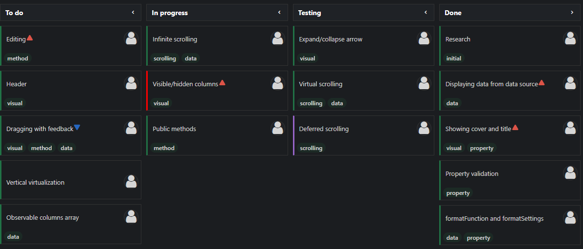
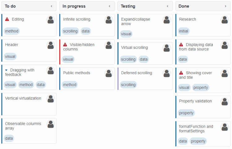
Tasks
In Smart.Kanban data loaded from the data source is visualized via task cards displayed in columns. Tasks have various properties reflected in the cards. Details abount these are listed below.
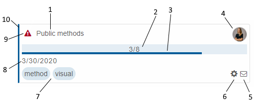
- Text - corresponds to the data source text field.
- Completed sub-tasks - corresponds to the data source checklist field. Visiblity contolled by property taskProgress and whether sub-tasks are defined.
- Progress - corresponds to the data source progress field. Visiblity contolled by property taskProgress.
- User icon - corresponds to the data source userId field. Visiblity contolled by property taskUserIcon.
- Comments icon - opens the Comments list with comments corresponding to the data source comments field. Visiblity contolled by property taskComments.
- Actions icon - opens the Actions list (Edit/Copy/Remove). Visiblity contolled by property taskActions.
- Tags - corresponds to the data source tags field. Visiblity contolled by property taskTags.
- Due date - corresponds to the data source dueDate field. Visiblity contolled by property taskDue.
- Priority icon - by default, shown only for low and high priority. Corresponds to the data source priority field. Visiblity contolled by property taskPriority.
- Color band - corresponds to the data source color field. If color is not set, the theme's primary color is applied.
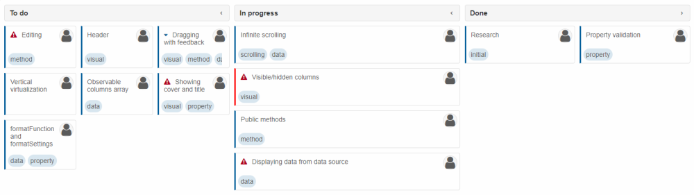
Task Drag/Drop
Smart.Kanban allows the dragging and dropping of tasks if the properties allowDrag and allowDrop are enabled (which, by default, they are).
Multiple tasks can be dragged simultaneously by selecting them first (in selectionMode: 'zeroOrManyExtended').
<!DOCTYPE html>
<html xmlns="http://www.w3.org/1999/xhtml">
<head>
    <title>Kanban Basic Demo</title>
    <meta http-equiv="X-UA-Compatible" content="IE=edge" />
    <meta http-equiv="Content-Type" content="text/html; charset=utf-8" />
    <meta name="viewport" content="width=device-width, initial-scale=1.0, maximum-scale=1.0" />
    <link rel="stylesheet" type="text/css" href="../../../source/styles/smart.default.css" />
    <script type="text/javascript" src="../../../scripts/data.js"></script>
    <script type="text/javascript" src="../../../source/modules/smart.kanban.js"></script>
    <script type="text/javascript">
        Smart('#kanban', class {
            get properties() {
                return {
                    allowDrag: true,
                    allowDrop: true,
                    collapsible: true,
                    dataSource: getKanbanData(),
                    selectionMode: 'zeroOrManyExtended',
                    columns: [
                        { label: 'To do', dataField: 'toDo' },
                        { label: 'In progress', dataField: 'inProgress' },
                        { label: 'Testing', dataField: 'testing' },
                        { label: 'Done', dataField: 'done' }
                    ]
                };
            }
        });
    </script>
</head>
<body>
    <smart-kanban id="kanban"></smart-kanban>
</body>
</html>
Demo
Dragging between multiple Kanbans is also supported:
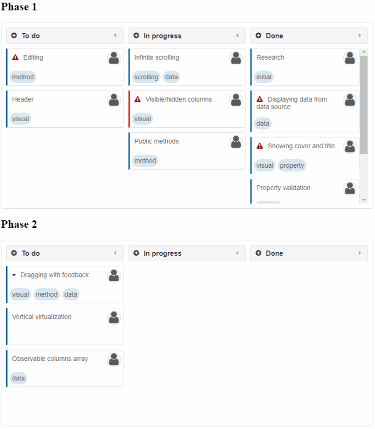
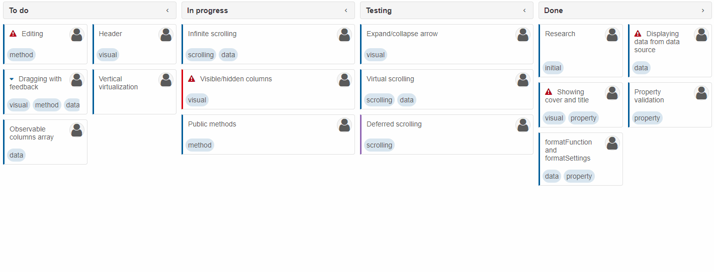
Column Collapsing
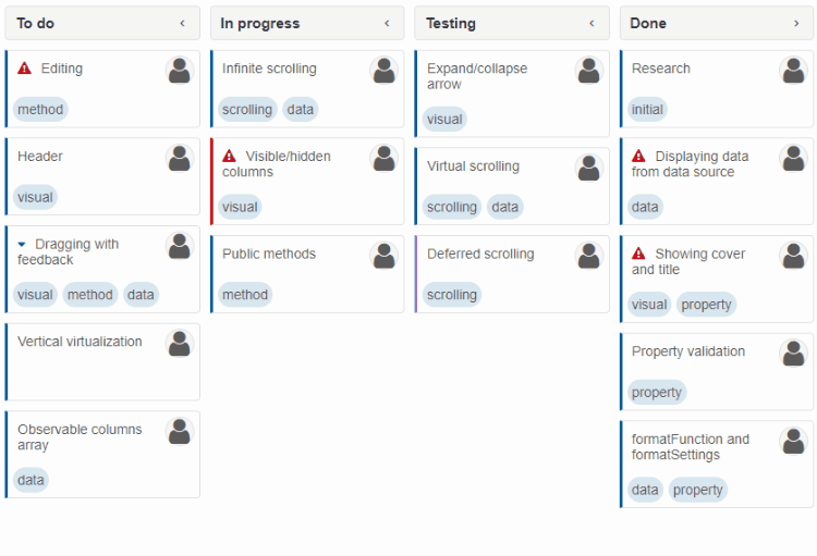
The columns of Smart.Kanban can be collapsed to make more space or highlight other columns. However, one column always remains expanded. Collapsing can be disabled by setting collapsible to true. To disable collapsing for particular columns only, set collapsible to false in their column definitions.
Column Orientation
Tasks in columns can either be vertically (default) or horizontally ordered. The orientation property can be applied in the column definition.
columns: [
    { label: 'To do', dataField: 'toDo', orientation: 'horizontal' },
    { label: 'In progress', dataField: 'inProgress', orientation: 'vertical' },
    { label: 'Done', dataField: 'done', orientation: 'horizontal' }
]
Resizing
Smart.Kanban is built upon the CSS Grid Layout technology which allows the component to seemlessly resize with minimum JavaScript calculations. This makes Kanban particularly useful when viewed on mobile devices.
Advanced Features
Details about the Kanban's advanced features is given in the following topics:
Methods
Smart.Kanban has the following methods:
- addFilter(filters, operator) - adds filtering.
- addSort(dataFields, orderBy) - adds sorting.
- addTask(data) - Adds a task to a Kanban column.
- beginEdit(task) - begins an edit operation.
- cancelEdit() - ends the current edit operation and discards changes.
- closePanel() - closes any open header panel (drop down).
- collapse(column) - collapses a Kanban column.
- copyTask(task) - creates a copy of a task in the same column.
- endEdit() - ends the current edit operation and saves changes.
- ensureVisible(task) - makes sure a task is visible by scrolling to it.
- expand(column) - expands a Kanban column.
- expandAll() - expands all Kanban columns.
- exportData(dataFormat, fileName, callback) - exports the Kanban's data.
- getState(task) - gets the Kanban's state.
- loadState(state) - loads the Kanban's state.
- moveTask(task, newStatus) - moves a task to a different column.
- openCustomizePanel() - opens the "Customize tasks" header panel (drop down).
- openFilterPanel() - opens the "Filter" header panel (drop down).
- openSortPanel() - opens the "Sort" header panel (drop down).
- removeFilter() - removes filtering.
- removeSort() - removes sorting.
- removeTask(task, prompt) - removes a task.
- saveState() - saves the Kanban's state to the browser's localStorage.
- updateTask(task, newData) - updates a task.
Append to the DOM:
const container = document.getElementById('kanban-container');
container.appendChild(kanban);
Remove from the DOM:
kanban.remove();
Set a property:
kanban.disabled = true;
kanban.theme = 'dark';
Get a property value:
const isDisabled = kanban.disabled;
const currentTheme = kanban.theme;
Invoke a method:
kanban.refresh();
kanban.focus();
Add event listener:
kanban.addEventListener('change', (event) => {
    console.log('change triggered:', event.detail.oldValue);
});
Remove event listener:
const handleKanbanEvent = (event) => {
    console.log('change triggered:', event.detail.oldValue);
};

kanban.addEventListener('change', handleKanbanEvent);
kanban.removeEventListener('change', handleKanbanEvent);
Accessibility
The Kanban component follows WAI-ARIA best practices:
- Keyboard navigation - Tab, Arrow keys, Enter, and Escape are supported
- ARIA roles - Appropriate roles and labels are applied automatically
- Focus management - Visible focus indicators for keyboard users
- Screen readers - State changes are announced to assistive technology
- High contrast - Supports Windows High Contrast Mode and forced colors
For custom labeling, set aria-label or aria-labelledby attributes on the component.
Supported stacks: Smart UI targets Angular 17+, React 18+, Vue 3+, Node 18 LTS, and evergreen browsers; pin exact package versions to your org policy.