Getting Started with ListBox Web Component
Smart UI Web Components work with current evergreen browsers and Node 18+ for local tooling; pin package versions to match your project policy.
Smart UI is distributed as the smart-webcomponents NPM package. You can also use the full download from the Download page.
Quick start
- Install the package:
npm install smart-webcomponents
- Load the ListBox module (ES module script):
<script type="module" src="node_modules/smart-webcomponents/source/modules/smart.listbox.js"></script>
- Add the default stylesheet (prefer angular.json / bundler entry in app codebases; for plain HTML use a link):
<link rel="stylesheet" type="text/css" href="node_modules/smart-webcomponents/source/styles/smart.default.css" />
- Add markup in one of two ways - semantic custom element (the component tag is in your HTML) or a host
div(you mount programmatically with appendTo):
Semantic element (id matches the selector in Smart()):
<smart-list-box id="listbox"></smart-list-box>
Host container (id matches appendTo on Smart.ListBox):
<div id="listboxContainer"></div>
- Initialize after the module loads: define a const listboxOptions object, then either bind with Smart('#listbox', ...) on the semantic tag or use new Smart.ListBox({ ...listboxOptions, appendTo: '#listboxContainer' }) on the host
div:
<script type="module">
	import 'node_modules/smart-webcomponents/source/modules/smart.listbox.js';

	const listboxOptions = { selectionMode: "one" };

	// Option A - semantic <smart-list-box> with id="listbox"
	Smart('#listbox', class {
		get properties() {
			return listboxOptions;
		}
	});

	// Option B - host div id="listboxContainer"
	// const listboxInstance = new Smart.ListBox({
	// 	...listboxOptions,
	// 	appendTo: '#listboxContainer'
	// });

	// Option C - constructor(selector, options), then append the returned element yourself
	// const myListBox = new Smart.ListBox('#listbox', listboxOptions);
	// document.body.appendChild(myListBox);
</script>
Uncomment Option B when you use the host
div; use Option A when you use the semantic element. The Runtime cookbook also documents new Smart.ListBox('#listbox', listboxOptions) with appendChild, and document.createElement('smart-list-box') with .props or Object.assign (all are valid patterns; do not combine overlapping patterns for the same instance unless you intend multiple components). - Serve the folder over HTTP (or use your bundler dev server) and open the page.
Runtime cookbook
Alternative creation patterns and imperative APIs. These are all valid ways to create Smart UI components: semantic markup + Smart(); new Smart.ListBox({ ...options, appendTo: '#...' }); new Smart.ListBox('#listbox', listboxOptions) plus appendChild on the returned element; and document.createElement('smart-list-box') then assigning options via .props or Object.assign on the element.
Constructor with a selector string and options, then append the returned element (for example const myListBox = new Smart.ListBox('#listbox', listboxOptions)):
	const listboxOptions = { selectionMode: "one" };
	const myListBox = new Smart.ListBox('#listbox', listboxOptions);
	document.body.appendChild(myListBox);
Create with document.createElement('smart-list-box'), assign properties (same as any custom element), then append:
	const listboxOptions = { selectionMode: "one" };
	const listbox = document.createElement('smart-list-box');
	Object.assign(listbox, listboxOptions);
	document.body.appendChild(listbox);
Host on a div with appendTo (import the module, then instantiate when the document is ready; the container id must match appendTo):
	import "../../source/modules/smart.listbox.js";

	document.readyState === 'complete' ? init() : window.addEventListener('load', init);

	function init() {
		const listboxOptions = { selectionMode: "one" };
		const listbox = new Smart.ListBox({
			...listboxOptions,
			appendTo: '#listboxContainer'
		});
	}
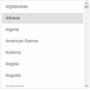
Demo
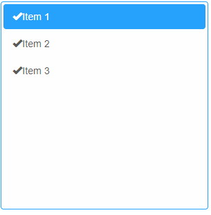
Appearance
Smart.ListBox allows to completely customize the content of the list items.
In order to change the content of an item, itemTemplate property has to be applied by assigning the id of an HTML Template element that's located inside the DOM. Here's an example:
<!DOCTYPE html>
<html lang="en">
<head>
 <link rel="stylesheet" href="../../source/styles/smart.default.css" type="text/css" />
 <script type="text/javascript" src="../../source/modules/smart.listbox.js"></script>
</head>
<body>
 <template id="template">
     <span class="glyphicon glyphicon-ok"></span>
     <span>{{label}}</span>
 </template>
 <smart-list-box item-template="template">
     <smart-list-item value="1">Item 1</smart-list-item>
     <smart-list-item value="2">Item 2</smart-list-item>
     <smart-list-item selected value="3">Item 3</smart-list-item>
 </smart-list-box>
</body>
</html>
The template contains a binding field surrounded by curly braces {{ label }}. The text between the brackets can be random.
Demo
Data Binding
Adding data to the list box can be accomplished in a few ways:
-
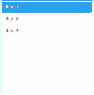
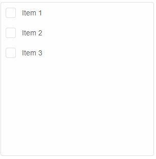
Nesting jqxListItem elements inside the list box's body in the HTML:
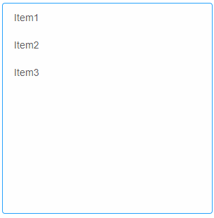
 <smart-list-box>
     <smart-list-item value="value1">Item1</smart-list-item>
     <smart-list-item selected value="value2">Item2</smart-list-item>
     <smart-list-item value="value3">Item3</smart-list-item>
 </smart-list-box>
Demo
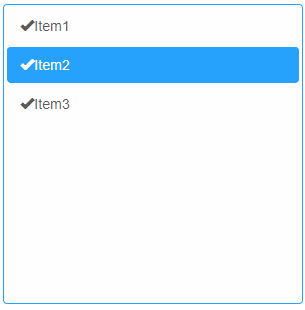
Smart.ListItem has a label and a value property. The value property can have a separate value from the label or no value at all. The user can prefer to apply a value only to the label and it will be automatically assigned to value as well.
The text inside the list item represents the value of the label property. It can also be set in the HTML code like shown in the example above.
-
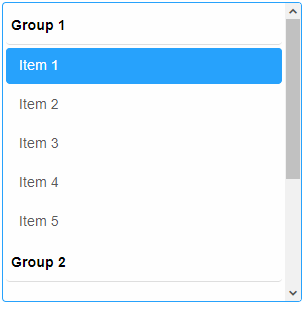
Nesting Smart.ListItemGroup elements inside the list box's body in the HTML:
<smart-list-box>
    <smart-list-items-group label="Group 1">
        <smart-list-item>Item 1</smart-list-item>
        <smart-list-item>Item 2</smart-list-item>
        <smart-list-item>Item 3</smart-list-item>
    </smart-list-items-group>
    <smart-list-items-group label="Group 2">
        <smart-list-item>Item 4</smart-list-item>
        <smart-list-item>Item 5</smart-list-item>
        <smart-list-item>Item 6</smart-list-item>
    </smart-list-items-group>
    <smart-list-items-group label="Group 3">
        <smart-list-item>Item 7</smart-list-item>
        <smart-list-item>Item 8</smart-list-item>
        <smart-list-item>Item 9</smart-list-item>
    </smart-list-items-group>
</smart-list-box>
Demo
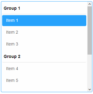
Smart.ListItemGroup represents a group of items.
-
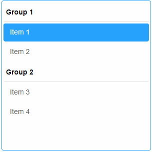
Nesting HTML list elements inside the list box's body in the HTML:
<smart-list-box>
     <ul label="Group 1">
         <li>Item 1</li>
         <li>Item 2</li>
         <li>Item 3</li>
         <li>Item 4</li>
         <li>Item 5</li>
     </ul>
     <ul label="Group 2">
         <li>Item 6</li>
         <li>Item 7</li>
         <li>Item 8</li>
         <li>Item 9</li>
         <li>Item 10</li>
     </ul>
 </smart-list-box>
List items can be added without the ul tag. The grouping can be added at a later stage by setting the grouped property to the element.
Demo
-
Nesting optgroup elements inside the list box's body in the HTML:
<smart-list-box>
     <optgroup label="Group 1">
         <option value="1">Item 1</option>
         <option value="2">Item 2</option>
     </optgroup>
     <optgroup label="Group 2">
         <option value="3">Item 3</option>
         <option value="4">Item 4</option>
     </optgroup>
 </smart-list-box>
optgroups are the items of an HTML select element. As usual the value attribute can be applied to each list item to assign a specific value that can differ from the label.
Demo
-
Setting the dataSource property of the element to a new value of type Array.
The property can be changed dynamically via javascript after the element has been initialized:
<!DOCTYPE html>
<html>
<head>
 <link rel="stylesheet" href="./../../source/styles/smart.default.css" type="text/css" />
 <script type="text/javascript" src="../../source/modules/smart.listbox.js"></script>
 <script>
 window.onload = function () {
     document.querySelector('smart-list-box').dataSource =
         [
             "Item 1",
             "Item 2",
             "Item 3"
         ];
 }
 </script>
</head>
<body>
 <smart-list-box></smart-list-box>
</body>
</html>
Demo
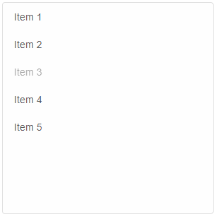
dataSource accepts Arrays of strings or Objects. An object can contain more specific data for the items. For example:
<!DOCTYPE html>
<html>
<head>
 <link rel="stylesheet" href="./../../source/styles/smart.default.css" type="text/css" />
 <script type="text/javascript" src="../../source/modules/smart.listbox.js"></script>
 <script>
 window.onload = function () {
     var listBox = document.querySelector('smart-list-box');
     listBox.dataSource = [
         {
             label: 'Item 1',
             value: 1
         },
         {
             label: 'Item 2',
             value: 2
         },
         {
             label: 'Item 3',
             value: 3,
             disabled: true
         },
         {
             label: 'Item 4',
             value: 4
         },
         {
             label: 'Item 5',
             value: 5
         },
     ];
 }
 </script>
</head>
<body>
 <smart-list-box></smart-list-box>
</body>
</html>
Demo
Like every other custom element property, dataSource can also be set from the HTML in the tag of the element, like so:
<smart-list-box data-source='["Item1", "Item2", "Item3"]'></smart-list-box>
Demo
Manipulating the content
The element offers the following methods:
-
Insert method can create and insert new list items into the element.
The insert method can be called at any time after the element has been initialized.
The method accepts two arguments:
- The index at which the item will be inserted.
- An array of strings or a single string representing the labels of the items to be inserted.
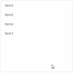
<!DOCTYPE html>
<html>
<head>
 <link rel="stylesheet" href="./../../source/styles/smart.default.css" type="text/css" />
 <script type="text/javascript" src="../../source/modules/smart.listbox.js"></script>
 <script>
     window.onload = function () {
         var listBox = document.querySelector('smart-list-box');
         listBox.insert(0, ["Item1", "Item2", "Item3"]);
         listBox.insert(2, 'Item4');
     }
 </script>
</head>
<body>
 <smart-list-box></smart-list-box>
</body>
</html>
Demo
-
Update method allow List items to be modified after creation.
Update method accepts two arguments:- The index of the item to be updated.
- Details for the item. This argument can be an object containing properties of Smart.ListItem, e.g. label, value, disabled. It can also be a simple string that represents the new label of the item that will be updated.
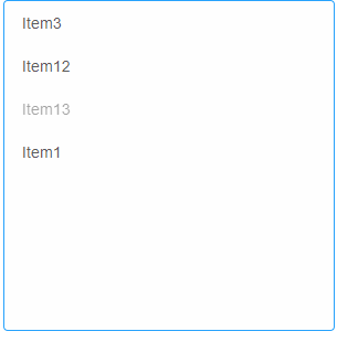
<!DOCTYPE html>
<html>
<head>
 <link rel="stylesheet" href="./../../source/styles/smart.default.css" type="text/css" />
 <script type="text/javascript" src="../../source/modules/smart.listbox.js"></script>
 <script>
     window.onload = function () {
         var listBox = document.querySelector('smart-list-box');
         //Create items
         listBox.insert(0, ["Item1", "Item2", "Item3"]);
         listBox.insert(2, 'Item4');
         //Update items
         listBox.update(1, 'Item12');
         listBox.update(2, { label: 'Item13', value: '13', disabled: true });
     }
 </script>
</head>
<body>
 <smart-list-box></smart-list-box>
</body>
</html>
Demo
-
Remove deletes an item from the element. The method accepts a single argument - the index of the item to be removed.
Here's an example:
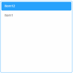
<!DOCTYPE html>
<html>
<head>
 <link rel="stylesheet" href="./../../source/styles/smart.default.css" type="text/css" />
 <script type="text/javascript" src="../../source/modules/smart.listbox.js"></script>
 <script>
     window.onload = function () {
         var listBox = document.querySelector('smart-list-box');
         //Create items
         listBox.insert(0, ["Item1", "Item2", "Item3"]);
         listBox.insert(2, 'Item4');
         //Update items
         listBox.update(1, 'Item12');
         listBox.update(2, { label: 'Item13', value: '13', disabled: true });
         //Remove items
         listBox.remove(2);
         listBox.remove(0);
     }
 </script>
</head>
<body>
 <smart-list-box></smart-list-box>
</body>
</html>
Demo
-
clearItems removes all items from the element. Take no arguments:
window.onload = function () {
    var listBox = document.querySelector('smart-list-box');
    listBox.clearItems();
}
Demo
Behavior
jqxListBox has multiple selection modes that define it's behavior:
- none - item selection is disabled
- default - single selection that allows multiple items to be selected using the keyboard keys : "SHIFT" or "CTRL".
- zeroOrMany - multiple item selection that allows empty selection.
- oneOrMany - multiple item selection that allows at least one item to be selected.
- zeroOrOne - single item selection that allows empty selection as well.
- one - single item selection. Doesn't allow empty selection. One item must always be selected.
- checkBox - multiple item selection using check boxes. Allows empty selection.
- radioButton - single item selection using radio buttons. If grouping is enabled the selection mode allows one selected item per group
Selection mode can be changed using javascript like so:
                    <!DOCTYPE html>
<html>
<head>
 <link rel="stylesheet" href="./../../source/styles/smart.default.css" type="text/css" />
 <script type="text/javascript" src="../../source/modules/smart.listbox.js"></script>
 <script>
 window.onload = function () {
     var listBox = document.querySelector('smart-list-box');
     listBox.selectionMode = 'checkBox';
 }
 </script>
</head>
<body>
 <smart-list-box>
     <smart-list-item>Item 1</smart-list-item>
     <smart-list-item>Item 2</smart-list-item>
     <smart-list-item>Item 3</smart-list-item>
 </smart-list-box>
</body>
</html>
Demo
Keyboard Support
The following keys apply to the dropDownList popup when it's opened:
| Key | Action |
|---|---|
| Arrow Up / Arrow Left | Navigate to the previous item. |
| Arrow Down / Arrow Right | Navigate to the next item. |
| Home | Navigate to the first item. |
| End | Navigate to the last item. |
| Page Up | Navigate to the first item in the next page. |
| Page Down | Navigate to the last item of the previous page. |
| Space / Enter | Selects / Deselects an item. |
Append to the DOM:
const container = document.getElementById('listbox-container');
container.appendChild(listbox);
Remove from the DOM:
listbox.remove();
Set a property:
listbox.disabled = true;
listbox.theme = 'dark';
Get a property value:
const isDisabled = listbox.disabled;
const currentTheme = listbox.theme;
Invoke a method:
listbox.refresh();
listbox.focus();
Add event listener:
listbox.addEventListener('change', (event) => {
    console.log('change triggered:', event.detail.addedItems);
});
Remove event listener:
const handleListBoxEvent = (event) => {
    console.log('change triggered:', event.detail.addedItems);
};

listbox.addEventListener('change', handleListBoxEvent);
listbox.removeEventListener('change', handleListBoxEvent);
Accessibility
The ListBox component follows WAI-ARIA best practices:
- Keyboard navigation - Tab, Arrow keys, Enter, and Escape are supported
- ARIA roles - Appropriate roles and labels are applied automatically
- Focus management - Visible focus indicators for keyboard users
- Screen readers - State changes are announced to assistive technology
- High contrast - Supports Windows High Contrast Mode and forced colors
For custom labeling, set aria-label or aria-labelledby attributes on the component.
Supported stacks: Smart UI targets Angular 17+, React 18+, Vue 3+, Node 18 LTS, and evergreen browsers; pin exact package versions to your org policy.