Getting Started with Toast Web Component
Smart UI Web Components work with current evergreen browsers and Node 18+ for local tooling; pin package versions to match your project policy.
Smart UI is distributed as the smart-webcomponents NPM package. You can also use the full download from the Download page.
Quick start
- Install the package:
npm install smart-webcomponents
- Load the Toast module (ES module script):
<script type="module" src="node_modules/smart-webcomponents/source/modules/smart.toast.js"></script>
- Add the default stylesheet (prefer angular.json / bundler entry in app codebases; for plain HTML use a link):
<link rel="stylesheet" type="text/css" href="node_modules/smart-webcomponents/source/styles/smart.default.css" />
- Add markup in one of two ways - semantic custom element (the component tag is in your HTML) or a host
div(you mount programmatically with appendTo):
Semantic element (id matches the selector in Smart()):
<smart-toast id="toast"></smart-toast>
Host container (id matches appendTo on Smart.Toast):
<div id="toastContainer"></div>
- Initialize after the module loads: define a const toastOptions object, then either bind with Smart('#toast', ...) on the semantic tag or use new Smart.Toast({ ...toastOptions, appendTo: '#toastContainer' }) on the host
div:
<script type="module">
	import 'node_modules/smart-webcomponents/source/modules/smart.toast.js';

	const toastOptions = { position: "top-left" };

	// Option A - semantic <smart-toast> with id="toast"
	Smart('#toast', class {
		get properties() {
			return toastOptions;
		}
	});

	// Option B - host div id="toastContainer"
	// const toastInstance = new Smart.Toast({
	// 	...toastOptions,
	// 	appendTo: '#toastContainer'
	// });

	// Option C - constructor(selector, options), then append the returned element yourself
	// const myToast = new Smart.Toast('#toast', toastOptions);
	// document.body.appendChild(myToast);
</script>
Uncomment Option B when you use the host
div; use Option A when you use the semantic element. The Runtime cookbook also documents new Smart.Toast('#toast', toastOptions) with appendChild, and document.createElement('smart-toast') with .props or Object.assign (all are valid patterns; do not combine overlapping patterns for the same instance unless you intend multiple components). - Serve the folder over HTTP (or use your bundler dev server) and open the page.
Runtime cookbook
Alternative creation patterns and imperative APIs. These are all valid ways to create Smart UI components: semantic markup + Smart(); new Smart.Toast({ ...options, appendTo: '#...' }); new Smart.Toast('#toast', toastOptions) plus appendChild on the returned element; and document.createElement('smart-toast') then assigning options via .props or Object.assign on the element.
Constructor with a selector string and options, then append the returned element (for example const myToast = new Smart.Toast('#toast', toastOptions)):
	const toastOptions = { position: "top-left" };
	const myToast = new Smart.Toast('#toast', toastOptions);
	document.body.appendChild(myToast);
Create with document.createElement('smart-toast'), assign properties (same as any custom element), then append:
	const toastOptions = { position: "top-left" };
	const toast = document.createElement('smart-toast');
	Object.assign(toast, toastOptions);
	document.body.appendChild(toast);
Host on a div with appendTo (import the module, then instantiate when the document is ready; the container id must match appendTo):
	import "../../source/modules/smart.toast.js";

	document.readyState === 'complete' ? init() : window.addEventListener('load', init);

	function init() {
		const toastOptions = { position: "top-left" };
		const toast = new Smart.Toast({
			...toastOptions,
			appendTo: '#toastContainer'
		});
	}
Appearance
By default Smart.Toast's instance has text(set by value property), icon(set via CSS) and close button( it's visibility is controlled by showCloseButton property). This may be changed by applying custom template via itemTemplate property
By default newly opened toast instances are opened in the browsers top-right corner. This can be changed by setting the position property. There are four available options:
- 'top-left' - renders newly opened toasts in the top-left browser's corner
- 'top-right' - renders newly opened toasts in the top-right browser's corner
- 'bottom-left' - renders newly opened toasts in the bottom-left browser's corner
- 'bottom-right' - renders newly opened toasts in the bottom-right browser's corner
Demo

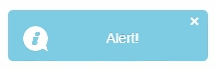
All toast instances are stored vertically in these common containers. The vertical order corresponds to the order of opening.
Another property, responsible about toast's positioning is appendTo. It allows toast rendering in custom container chosen by the user. If appendTo is set, then the position settings are disregarded.
 <smart-toast id="toast1" auto-open show-close-button class="animation blink">Alert!</smart-toast>
 <div class="toast-container" id="toastContainer2"></div>
Demo
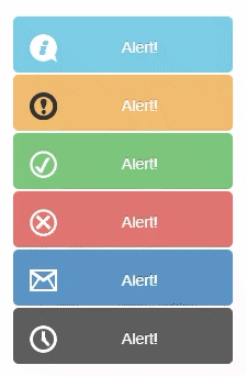
The different toast type styling cane be set via set type property. Allowed values are 'info', 'warning', 'success', 'error', 'mail', 'time'.
 <smart-toast auto-open append-to="toastContainer" type="info">Alert!</smart-toast>
 <smart-toast auto-open append-to="toastContainer" type="warning">Alert!</smart-toast>
 <smart-toast auto-open append-to="toastContainer" type="success">Alert!</smart-toast>
 <smart-toast auto-open append-to="toastContainer" type="error">Alert!</smart-toast>
 <smart-toast auto-open append-to="toastContainer" type="mail">Alert!</smart-toast>
 <smart-toast auto-open append-to="toastContainer" type="time">Alert!</smart-toast>
 <div class="toast-container" id="toastContainer"></div>
Demo
Behavior
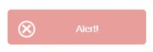
Smart.Toast could be modal. It's controlled by "modal" boolean property.
<smart-toast modal type="success">Alert!</smart-toast>
Demo

The animation class added in Smart.Toast, produces smooth animation on open/close.
<smart-toast auto-open class="animation">Alert!</smart-toast>
Demo

The blink class added in Smart.Toast, produces blinking effect when an instance is opened.
<smart-toast auto-open type="error" class="blink">Alert!</smart-toast>
Demo
Manipulating the content
Smart.Toast allows updating the content of the last opened item by changing toast's value
 <script>
     window.onload = function () {
         var toast = document.getElementById('toast');
         toast.value = 'Toast\'s value is updated !!!';
     }
 </script>
Methods
open - opens a new toast instance
 <script>
     window.onload = function () {
         var toast = document.getElementById('toast');
         toast.open();
     }
 </script>
closeAll - closes all opened toast instances
 <script>
     window.onload = function () {
         var toast = document.getElementById('toast');
         toast.closeAll();
     }
 </script>
closeItem - closes particular toast instance
 <script>
     window.onload = function () {
         var toast = document.getElementById('toast');
         toast.closeItem('itemId');
     }
 </script>
closeLast - closes last opened instance
 <script>
     window.onload = function () {
         var toast = document.getElementById('toast');
         toast.closeLast();
     }
 </script>
Append to the DOM:
const container = document.getElementById('toast-container');
container.appendChild(toast);
Remove from the DOM:
toast.remove();
Set a property:
toast.disabled = true;
toast.theme = 'dark';
Get a property value:
const isDisabled = toast.disabled;
const currentTheme = toast.theme;
Invoke a method:
toast.refresh();
toast.focus();
Add event listener:
toast.addEventListener('itemClick', (event) => {
    console.log('itemClick triggered:', event.detail);
});
Remove event listener:
const handleToastEvent = (event) => {
    console.log('itemClick triggered:', event.detail);
};

toast.addEventListener('itemClick', handleToastEvent);
toast.removeEventListener('itemClick', handleToastEvent);
Common Use Cases
-
Show notification
Display a toast message
toast.open();
-
Auto-close notification
Set toast to dismiss automatically
toast.autoClose = true;
toast.autoCloseDelay = 3000;
toast.open();
Troubleshooting
- How do I show different toast types?
- Set the type property to 'info', 'success', 'warning', or 'error' for different visual styles.
- How do I position toasts?
- Set the position property to 'top-left', 'top-right', 'bottom-left', or 'bottom-right'.
Accessibility
The Toast component follows WAI-ARIA best practices:
- Keyboard navigation - Tab, Arrow keys, Enter, and Escape are supported
- ARIA roles - Appropriate roles and labels are applied automatically
- Focus management - Visible focus indicators for keyboard users
- Screen readers - State changes are announced to assistive technology
- High contrast - Supports Windows High Contrast Mode and forced colors
For custom labeling, set aria-label or aria-labelledby attributes on the component.
Supported stacks: Smart UI targets Angular 17+, React 18+, Vue 3+, Node 18 LTS, and evergreen browsers; pin exact package versions to your org policy.