Angular DockingLayout - Setup
Smart UI for Angular supports both standalone components (bootstrapApplication) and NgModule-based apps (bootstrapModule(AppModule)). Steps 1-5 show the standalone path; the section below shows the NgModule path with the same package and styles.
Demo source (Smart UI repo): angular/src/docking-layout/overview
1 NPM Install
Install the smart-webcomponents-angular package:
npm install smart-webcomponents-angular
2 Register styles
Add the default Smart UI stylesheet to angular.json -> projects -> <your-project> -> architect -> build -> options -> styles (merge with existing entries):
"styles": [
		"node_modules/smart-webcomponents-angular/source/styles/smart.default.css"
	]
Add optional theme CSS from the same package after smart.default.css if you use Bootstrap, Fluent, or other bundled themes.
3 Import the Angular module
Import DockingLayoutModule from smart-webcomponents-angular/dockinglayout: use @Component.imports for standalone, or add it to your AppModule (or feature module) imports array for NgModule apps.
import { DockingLayoutModule } from 'smart-webcomponents-angular/dockinglayout';
4 Root component (standalone)
Add DockingLayoutModule to your root standalone component (src/app/app.ts). Snippet from Smart UI demos (paths normalized to app.html / App where applicable):
import { Component, ViewChild, AfterViewInit, ViewEncapsulation, Inject, ElementRef, ViewContainerRef } from '@angular/core';
import { Smart, DockingLayoutComponent } from 'smart-webcomponents-angular/dockinglayout';
import { SliderComponent } from 'smart-webcomponents-angular/slider';
import { MultilineTextBoxComponent } from 'smart-webcomponents-angular/multilinetextbox';
import { DockingLayoutModule } from 'smart-webcomponents-angular/dockinglayout';
import { TabsModule } from 'smart-webcomponents-angular/tabs';
import { TextBoxModule } from 'smart-webcomponents-angular/textbox';
import { SliderModule } from 'smart-webcomponents-angular/slider';
import { MultilineTextBoxModule } from 'smart-webcomponents-angular/multilinetextbox';
import { FormsModule } from '@angular/forms';
@Component({
selector: 'app-root',
standalone: true,
imports: [FormsModule, DockingLayoutModule, TabsModule, TextBoxModule, SliderModule, MultilineTextBoxModule],
templateUrl: './app.html',
styleUrl: './app.css'
})
export class App implements AfterViewInit {
@ViewChild('slider', { read: SliderComponent, static: false }) slider!: SliderComponent;
@ViewChild('multilinetextbox', { read: MultilineTextBoxComponent, static: false }) multilinetextbox!: MultilineTextBoxComponent;
@ViewChild('docking', { read: DockingLayoutComponent, static: false }) docking!: DockingLayoutComponent;
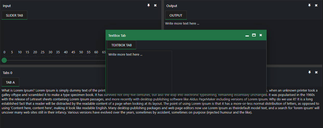
layout = [
{
type: 'LayoutGroup',
orientation: 'horizontal',
items: [
{
type: 'LayoutGroup',
items: [
{
type: 'LayoutPanel',
id: 'tabPanel',
label: 'Input',
items: [{
label: 'TextBox Tab',
content: ''
},
{
label: 'Slider Tab',
content: ''
}],
size: '50%'
},
{
type: 'LayoutPanel',
label: 'Output',
items: [
{
id: 'outputTab',
label: 'Output',
headerPosition: 'none',
content: 'Lorem Ipsum is simply dummy text of the printing and typesetting industry.'
}
]
}
],
orientation: 'vertical',
size: '50%'
},
{
id: 'item0',
label: 'Tabs 0',
items: [{
label: 'Tab A',
selected: true,
content: 'What is Lorem Ipsum?\n' +
'Lorem Ipsum is simply dummy text of the printing and typesetting industry. Lorem Ipsum has been the industry\'s standard dummy text ever since the 1500s, when an unknown printer took a galley of' + 'type and scrambled it to make a type specimen book. It has survived not only five centuries, but also the leap into electronic typesetting, remaining essentially unchanged. It was popularised in ' + 'the 1960s with the release of Letraset sheets containing Lorem Ipsum passages, and more recently with desktop publishing software like Aldus PageMaker including versions of Lorem Ipsum.\n' +
'Why do we use it?\n' +
'It is a long established fact that a reader will be distracted by the readable content of a page when looking at its layout. The point of using Lorem Ipsum is that it has a more-or-less normal ' + 'distribution of letters, as opposed to using \'Content here, content here\', making it look like readable English. Many desktop publishing packages and web page editors now use Lorem Ipsum as their' + 'default model text, and a search for \'lorem ipsum\' will uncover many web sites still in their infancy. Various versions have evolved over the years, sometimes by accident, sometimes on ' + 'purpose (injected humour and the like).'
}]
}]
}];
handleMultilineTextBoxChange(event: Event) {
if (document.getElementById('outputTab')) {
const target = event.target as MultilineTextBoxComponent
document.getElementById('outputTab')!.innerHTML = target?.value;
}
}
handleSliderChange(event: CustomEvent) {
if (document.getElementById('outputTab')) {
document.getElementById('outputTab')!.innerHTML = event.detail.value;
}
}
ngAfterViewInit(): void {
this.docking.update('tabPanel',
{
type: 'LayoutPanel',
id: 'tabPanel',
label: 'Input',
items: [{
index: 0,
label: 'TextBox Tab',
content: this.multilinetextbox.nativeElement
},
{
index: 1,
label: 'Slider Tab',
content: this.slider.nativeElement
}],
size: '50%'
}
);
}
}
Boot the app with bootstrapApplication from src/main.ts and an ApplicationConfig in src/app/app.config.ts as generated by the CLI.
5 Template (standalone)
Use your markup in src/app/app.html (or inline template). Bind properties and events on smart-docking-layout as needed:
 <smart-docking-layout #docking [layout]="layout"></smart-docking-layout>
<smart-slider #slider (onChange)="handleSliderChange($event)"></smart-slider>
<smart-multiline-text-box #multilinetextbox (onChange)="handleMultilineTextBoxChange($event)">Write more text here ...</smart-multiline-text-box>
6 NgModule bootstrap (also supported)
Same npm package and angular.json styles as steps 1-2. Put DockingLayoutModule on your NgModule.imports instead of @Component.imports, and bootstrap with bootstrapModule(AppModule).
The demo sources bundled for this widget use standalone only (there is no app.module.ts in that folder). NgModule is fully supported: put DockingLayoutModule from smart-webcomponents-angular/dockinglayout on NgModule.imports, make your root component non-standalone (remove standalone: true and move widget modules from @Component.imports to the module), and bootstrap with platformBrowserDynamic().bootstrapModule(AppModule).
Minimal main.ts + app.module.ts pairing (adjust paths to match your CLI layout):
src/main.ts
import { platformBrowserDynamic } from '@angular/platform-browser-dynamic';
import { AppModule } from './app/app.module';

platformBrowserDynamic().bootstrapModule(AppModule).catch((err) => console.error(err));
src/app/app.module.ts
import { NgModule } from '@angular/core';
import { BrowserModule } from '@angular/platform-browser';
import { AppComponent } from './app.component';
import { DockingLayoutModule } from 'smart-webcomponents-angular/dockinglayout';

@NgModule({
	declarations: [ AppComponent ],
	imports: [ BrowserModule, DockingLayoutModule ],
	bootstrap: [ AppComponent ]
})
export class AppModule { }
Reuse the template and class logic from steps 4-5 in AppComponent, configured for declarations + NgModule.imports instead of a standalone @Component.
Run
ng serve or npm start - then open http://localhost:4200/.
Smart UI for Angular - full documentation
Accessibility
The DockingLayout component follows WAI-ARIA best practices:
- Keyboard navigation - Tab, Arrow keys, Enter, and Escape are supported
- ARIA roles - Appropriate roles and labels are applied automatically
- Focus management - Visible focus indicators for keyboard users
- Screen readers - State changes are announced to assistive technology
- High contrast - Supports Windows High Contrast Mode and forced colors
For custom labeling, set aria-label or aria-labelledby attributes on the component.
Supported stacks: Smart UI targets Angular 17+, React 18+, Vue 3+, Node 18 LTS, and evergreen browsers; pin exact package versions to your org policy.