Getting Started with React DockingLayout Component
Smart UI React targets React 18+ and current Node LTS for tooling; use TypeScript templates when you want typed props and events.
Demo source (Smart UI repo): react/source/docking-layout/overview/App.jsx
1 Create a Vite + React + TypeScript app
npm create vite@latest my-smart-app -- --template react-ts
cd my-smart-app
thennpm install
2 Install Smart UI for React
npm install smart-webcomponents-react
3 Import styles and render the component
Open src/App.tsx (or App.jsx if you chose JavaScript). The snippet below matches Smart UI React demos for this widget:
import 'smart-webcomponents-react/source/styles/smart.default.css';
import './App.css';
import React, { useEffect } from 'react';
import ReactDOM from 'react-dom/client';
import { DockingLayout } from 'smart-webcomponents-react/dockinglayout';
import { Slider } from 'smart-webcomponents-react/slider';
import { MultilineTextBox } from 'smart-webcomponents-react/multilinetextbox';
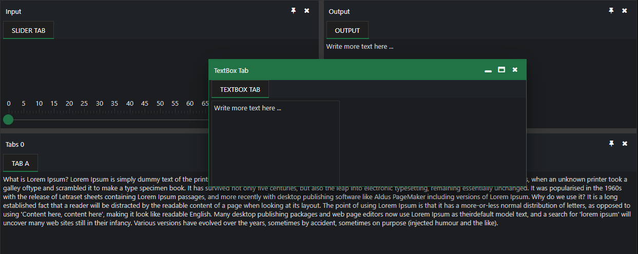
const layout = [
{
type: 'LayoutGroup',
orientation: 'horizontal',
items: [
{
type: 'LayoutGroup',
orientation: 'vertical',
items: [
{
type: 'LayoutPanel',
id: 'tabPanel',
label: 'Input',
items: [
{
label: 'TextBox Tab',
content: '<div style="padding:10px;" id="firstContainer"></div>',
},
{
label: 'Slider Tab',
content: '<div style="padding:10px;" id="secondContainer"></div>',
},
],
},
{
type: 'LayoutPanel',
label: 'Output',
items: [
{
id: 'outputTab',
label: 'Output',
headerPosition: 'none',
content: 'Write more text here ...',
},
],
},
],
},
{
id: 'item0',
label: 'Tabs 0',
items: [
{
label: 'Tab A',
selected: true,
content:
`What is Lorem Ipsum?\nLorem Ipsum is simply dummy text of the printing and typesetting industry. ` +
`Lorem Ipsum has been the industry's standard dummy text ever since the 1500s, when an unknown printer ` +
`took a galley of type and scrambled it to make a type specimen book. It has survived not only five centuries, ` +
`but also the leap into electronic typesetting, remaining essentially unchanged.\n\n` +
`Why do we use it?\nIt is a long established fact that a reader will be distracted by the readable content ` +
`of a page when looking at its layout. The point of using Lorem Ipsum is that it has a more-or-less normal ` +
`distribution of letters, as opposed to using 'Content here, content here', making it look like readable English.`,
},
],
},
],
},
];
const App = () => {
const handleReady = () => {
const firstContainer = document.getElementById('firstContainer');
const secondContainer = document.getElementById('secondContainer');
if (firstContainer && !firstContainer.hasChildNodes()) {
ReactDOM.createRoot(firstContainer).render(<MultilineTextBox />);
}
if (secondContainer && !secondContainer.hasChildNodes()) {
ReactDOM.createRoot(secondContainer).render(<Slider />);
}
};
return (
<div>
<DockingLayout layout={layout} onReady={handleReady} />
</div>
);
};
export default App;
4 Run the dev server
npm run dev
Open the URL Vite prints (often http://localhost:5173/).
TypeScript Support
Types ship with smart-webcomponents-react. Import the component and prop types:
import type { DockingLayout, DockingLayoutProps } from 'smart-webcomponents-react/dockinglayout';
The generated wrappers expose on* callbacks (for example onChange) whose arguments are standard DOM Event values unless the widget typings narrow them further.
Accessibility
The DockingLayout component follows WAI-ARIA best practices:
- Keyboard navigation - Tab, Arrow keys, Enter, and Escape are supported
- ARIA roles - Appropriate roles and labels are applied automatically
- Focus management - Visible focus indicators for keyboard users
- Screen readers - State changes are announced to assistive technology
- High contrast - Supports Windows High Contrast Mode and forced colors
For custom labeling, set aria-label or aria-labelledby attributes on the component.
Supported stacks: Smart UI targets Angular 17+, React 18+, Vue 3+, Node 18 LTS, and evergreen browsers; pin exact package versions to your org policy.