Grid for Angular
Angular standalone version of this topic (compatible with Angular 17+). Import both the Smart UI component and module in the standalone component.
What this topic covers: practical setup, the framework-specific API access pattern, and copy-adapt guidance for the examples in this page.
import { Component, ViewChild, ViewEncapsulation } from '@angular/core';
import { CommonModule } from '@angular/common';
import { RouterOutlet } from '@angular/router';
import { GridComponent, GridModule } from 'smart-webcomponents-angular/grid';

@Component({
  selector: 'app-root',
  standalone: true,
  imports: [CommonModule, GridModule, RouterOutlet],
  templateUrl: './app.component.html',
  styleUrls: ['./app.component.css'],
  encapsulation: ViewEncapsulation.None
})
export class AppComponent {
  @ViewChild('grid', { read: GridComponent, static: false }) grid!: GridComponent;
}
<!-- app.component.html -->
<smart-grid #grid></smart-grid>
Use this.grid for API methods in this topic.
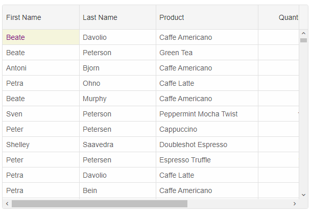
Cell Styling
Cell styling is possible by usingsetCellStyle method, cell object properties like background, color, fontSize, fontFamily, fontWeight and fontStyle properties.
this.grid.setCellStyle(0, 'firstName', {
	background: 'beige',
	color: 'purple'
})
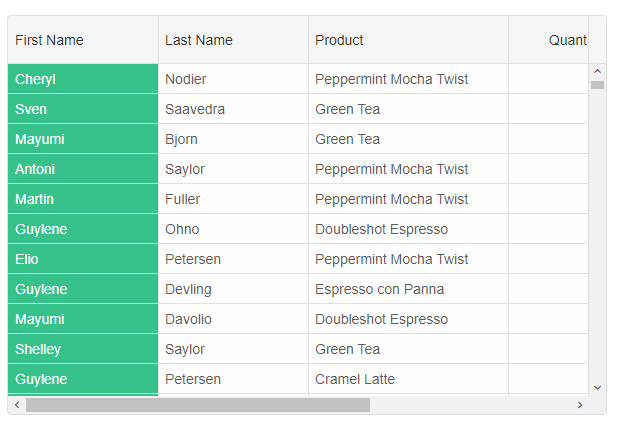
Cell Class
Cells styling by setting thecellsClassName column property. The property allows you to set a class or classes for the cells in this column. You can also set a function that returns a string or an array of strings.
columns: [
{
	label: 'First Name', width: 150, dataField: 'firstName', cellsClassName: 'cell-class-1'
},
{ label: 'Last Name', width: 150, dataField: 'lastName' },
{ label: 'Product', width: 200, dataField: 'productName' },
{ label: 'Quantity', width: 100, dataField: 'quantity' },
{ label: 'Unit Price', width: 100, dataField: 'price', cellsFormat: 'c2' },
{ label: 'Total', dataField: 'total', width: 200, cellsFormat: 'c2' }
]
and the CSS class name
.cell-class-1{
	background: #37C18B;
	color: white;
}
The following example shows how to use
cellsClassName as a function. The function gets called for each cell in the column with the following parameters: index - row's index, dataField - column's data field, cellValue - current cell's value, rowData - current row's data, row - GridRow object.
componentProps = {
    behavior: { columnResizeMode: 'growAndShrink' },
    dataSource: new window.JQX.DataAdapter({
        dataSource: window.Data,
        dataFields: [
            'id: number',
            'firstName: string',
            'lastName: string',
            'productName: string',
            'quantity: number',
            'price: number',
            'total: number'
        ]
    }),
    editing: {
        enabled: true
    },
    selection: {
        enabled: true,
        allowCellSelection: true,
        allowRowHeaderSelection: true,
        allowColumnHeaderSelection: true,
        mode: 'extended'
    },
    columns: [
        {
            label: 'First Name', dataField: 'firstName'
        },
        { label: 'Last Name', dataField: 'lastName' },
        { label: 'Product', width: 200, dataField: 'productName' },
        {
            label: 'Quantity', width: 100, dataField: 'quantity', cellsClassName: (index, dataField, value, rowData, row) => {
                if (value < 3) {
                    return 'cell-class-2';
                }

                if (index < 5) {
                    return 'cell-class-1';
                }

                if (index >= 5) {
                    return 'cell-class-3';
                }
            }
        },
        { label: 'Unit Price', width: 100, dataField: 'price', cellsFormat: 'c2' },
        { label: 'Total', dataField: 'total', cellsFormat: 'c2' }
    ]
};
CSS Class to a Cell
To apply a CSS class name to a cell, you can use the
highlightCell method.
this.grid.highlightCell(0, 'firstName', 'cell-class-1');
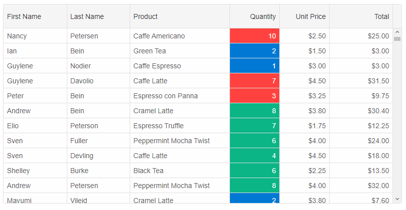
Format Function and Cells API
You can style cells dynamically by setting up the column'sformatFunction
columns: [
	{
		label: 'First Name', dataField: 'firstName', columnGroup: 'name'
	},
	{ label: 'Last Name', dataField: 'lastName', columnGroup: 'name' },
	{ label: 'Product', dataField: 'productName', columnGroup: 'order'},
	{ label: 'Order Date', cellsFormat: 'MM/dd/yyyy', dataField: 'date', columnGroup: 'order'},
	{ label: 'Quantity', dataField: 'quantity', columnGroup: 'order'},
	{ label: 'Unit Price', dataField: 'price', cellsFormat: 'c2', columnGroup: 'order', formatFunction(settings) {
		const rowId = settings.row;
		const columnDataField = settings.column;
		const template = settings.template;

		if (settings.value >= 4) {
			settings.cell.background = '#00A45A';
			settings.cell.color = '#fff';
		}
		else if (settings.value < 2)
		{
			settings.cell.background = '#DF3800';
			settings.cell.color = '#fff';
		}
		else {
			settings.cell.background = '#FFFDE1';
			settings.cell.color = '#333';
		}

		settings.value = '$' + new Number(settings.value).toFixed(2);
	}
	},
	{ label: 'Total', dataField: 'total', cellsFormat: 'c2', columnGroup: 'order', formatFunction(settings) {
		const rowId = settings.row;
		const columnDataField = settings.column;
		const template = settings.template;

		if (settings.value >= 20) {
			settings.cell.background = '#00A45A';
			settings.cell.color = '#fff';
		}
		if (settings.value <= 5) {
			settings.cell.background = '#DF3800';
			settings.cell.color = '#fff';
		}
		else {
			settings.cell.background = '#FFFDE1';
			settings.cell.color = '#333';
		}

		settings.value = '$' + new Number(settings.value).toFixed(2);
	} }
]
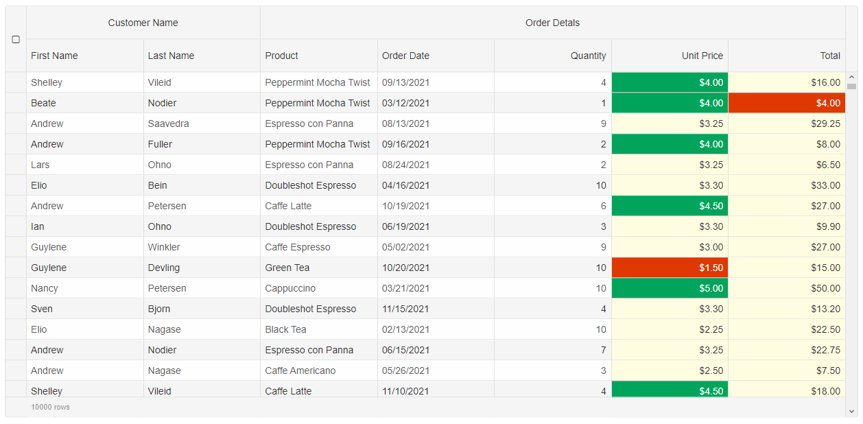
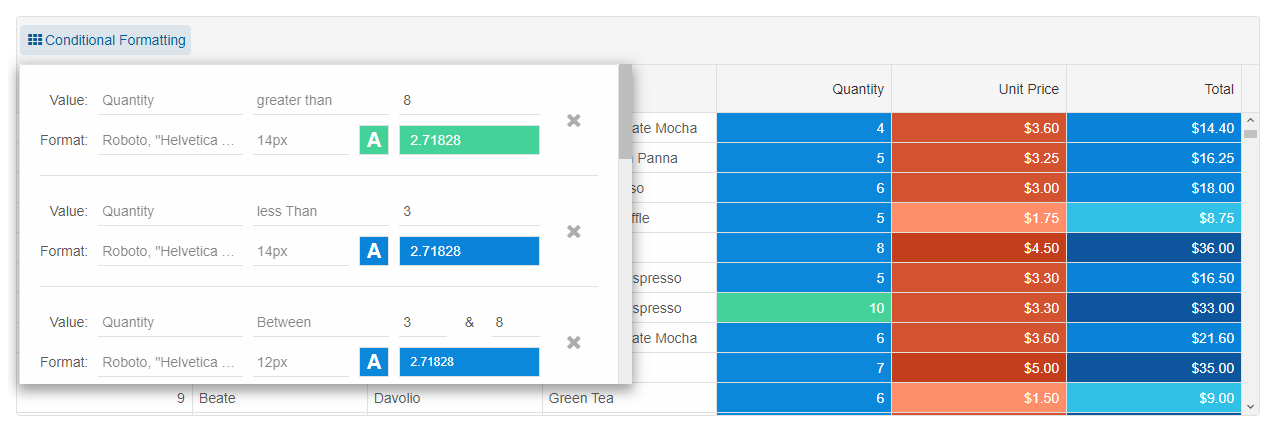
Conditional Formatting
Another way to apply formatting to the cells is to use the Grid'sconditionalFormatting feature. You can apply conditional formatting by using the Grid API, but you can also apply it through the UI and the built-in conditional formatting dialog.
conditionalFormatting: [
	{
		column: 'quantity',
		condition: 'greaterThan',
		firstValue: 8,
		text: '#FFFFFF',
		highlight: '#45D29A'
	},
	{
		column: 'quantity',
		condition: 'lessThan',
		firstValue: 3,
		text: '#FFFFFF',
		highlight: '#0984D9'
	},
	{
		column: 'quantity',
		condition: 'between',
		firstValue: 3,
		secondValue: 8,
		fontSize: '12px',
		text: '#ffffff',
		highlight: '#0C88DA'
	},
	{
		column: 'price',
		condition: 'lessThan',
		firstValue: 3,
		fontFamily: 'Courier New',
		text: '#FFFFFF',
		highlight: '#FF8F6B'
	},
	{
		column: 'price',
		condition: 'greaterThan',
		firstValue: 4,
		fontFamily: 'Courier New',
		text: '#FFFFFF',
		highlight: '#C43E1C'
	},
	{
		column: 'price',
		condition: 'between',
		firstValue: 3,
		secondValue: 4,
		fontFamily: 'Courier New',
		text: '#FFFFFF',
		highlight: '#D35230'
	},
	{
		column: 'total',
		condition: 'greaterThan',
		firstValue: 25,
		fontSize: '14px',
		text: '#FFFFFF',
		highlight: '#0D559D'
	},
	{
		column: 'total',
		condition: 'between',
		firstValue: 10,
		secondValue: 25,
		fontSize: '12px',
		text: '#ffffff',
		highlight: '#0883D8'
	},
	{
		column: 'total',
		condition: 'lessThan',
		firstValue: 10,
		fontSize: '10px',
		text: '#FFFFFF',
		highlight: '#31C1E7'
	}
]
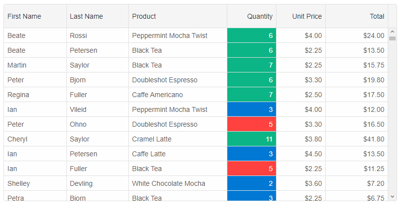
Cells CSS rules
Similarly to thecellClassName function, you can use CSS rules. The settings object contains the following properties: index, value, dataField, row, api.
columns: [
	{
		label: 'First Name', dataField: 'firstName'
	},
	{ label: 'Last Name', dataField: 'lastName' },
	{ label: 'Product', width: 200, dataField: 'productName' },
	{
		label: 'Quantity', width: 100, dataField: 'quantity', cellsCSSRules: {
			'cell-class-1': settings => settings.value === 5,
			'cell-class-2': settings => settings.value < 5,
			'cell-class-3': settings => settings.value > 5
		}
	},
	{ label: 'Unit Price', width: 100, dataField: 'price', cellsFormat: 'c2' },
	{ label: 'Total', dataField: 'total', cellsFormat: 'c2' }
]
For AI tooling
Developer Quick Reference
Topic: grid-styling-cells Component: Grid Framework: Angular
Main methods: setCellStyle(), highlightCell()
Common config keys: columns, behavior, dataSource, editing, selection
Implementation Notes
Compatibility: Angular 17+ (standalone) API access pattern: @ViewChild(...) + this.component.method()
Lifecycle guidance: Bind inputs declaratively and call imperative API through @ViewChild in/after ngAfterViewInit.
Common pitfalls:
- Using @ViewChild API too early (before view init).
- Omitting standalone imports for Smart modules in @Component.imports.
- Type mismatches between configuration fields and template bindings.
Validation checklist:
- Ensure module import exists in standalone component imports array.
- Use typed @ViewChild(..., { read: ComponentType }).
- Call imperative methods after view initialization.