



Angular Table - Setup
Smart UI for Angular supports both standalone components (bootstrapApplication) and NgModule-based apps (bootstrapModule(AppModule)). Steps 1-5 show the standalone path; the section below shows the NgModule path with the same package and styles.
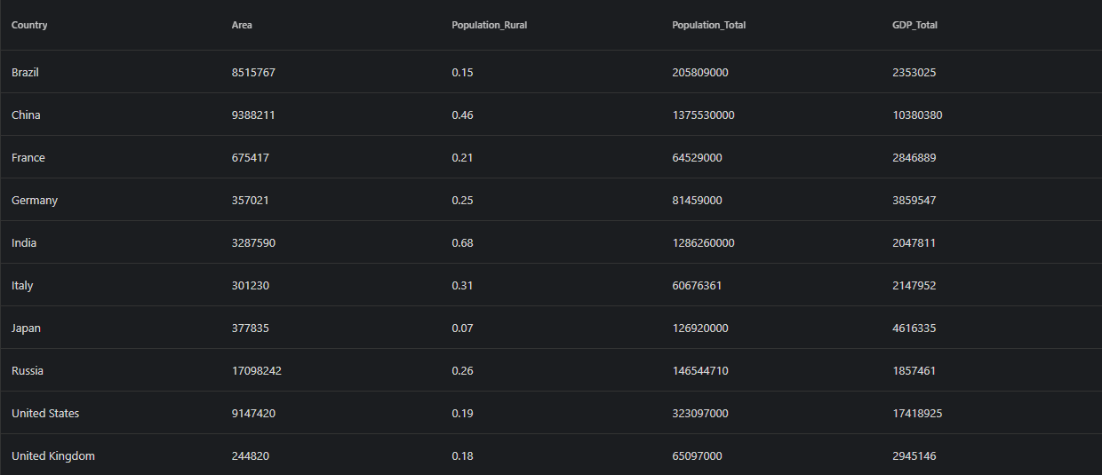
Demo source (Smart UI repo): angular/src/table/basic
1 NPM Install
Install the smart-webcomponents-angular package:
npm install smart-webcomponents-angular
2 Register styles
Add the default Smart UI stylesheet to angular.json -> projects -> <your-project> -> architect -> build -> options -> styles (merge with existing entries):
"styles": [
		"node_modules/smart-webcomponents-angular/source/styles/smart.default.css"
	]
Add optional theme CSS from the same package after smart.default.css if you use Bootstrap, Fluent, or other bundled themes.
3 Import the Angular module
Import TableModule from smart-webcomponents-angular/table: use @Component.imports for standalone, or add it to your AppModule (or feature module) imports array for NgModule apps.
import { TableModule } from 'smart-webcomponents-angular/table';
4 Root component (standalone)
Add TableModule to your root standalone component (src/app/app.ts). Snippet from Smart UI demos (paths normalized to app.html / App where applicable):
 import { Component, ViewChild, OnInit, AfterViewInit } from '@angular/core';
import { TableComponent, TableColumn } from 'smart-webcomponents-angular/table';

import { TableModule } from 'smart-webcomponents-angular/table';

@Component({
  selector: 'app-root',
  standalone: true,
  imports: [ TableModule ],
  templateUrl: './app.html',
  styleUrl: './app.css'
})

export class App implements AfterViewInit, OnInit {
	@ViewChild('table', { read: TableComponent, static: false }) table!: TableComponent;


	ngOnInit(): void {
		// onInit code.
	}

	ngAfterViewInit(): void {
		// afterViewInit code.
		this.init();
    }

	init(): void {
		// init code.


	}
}
Boot the app with bootstrapApplication from src/main.ts and an ApplicationConfig in src/app/app.config.ts as generated by the CLI.
5 Template (standalone)
Use your markup in src/app/app.html (or inline template). Bind properties and events on smart-table as needed:
 <div class="demo-description">Our Table web component can be used to wrap or replace standard Tables
    and add different styles, hover effects, sorting by one or multiple columns,
    add, remove and update rows.</div>
<smart-table #table id="table">
    <table>
        <thead>
            <tr>
                <th scope="col">Country</th>
                <th scope="col">Area</th>
                <th scope="col">Population_Rural</th>
                <th scope="col">Population_Total</th>
                <th scope="col">GDP_Total</th>
            </tr>
        </thead>
        <tbody>
            <tr>
                <td>Brazil</td>
                <td>8515767</td>
                <td>0.15</td>
                <td>205809000</td>
                <td>2353025</td>
            </tr>
            <tr>
                <td>China</td>
                <td>9388211</td>
                <td>0.46</td>
                <td>1375530000</td>
                <td>10380380</td>
            </tr>
            <tr>
                <td>France</td>
                <td>675417</td>
                <td>0.21</td>
                <td>64529000</td>
                <td>2846889</td>
            </tr>
            <tr>
                <td>Germany</td>
                <td>357021</td>
                <td>0.25</td>
                <td>81459000</td>
                <td>3859547</td>
            </tr>
            <tr>
                <td>India</td>
                <td>3287590</td>
                <td>0.68</td>
                <td>1286260000</td>
                <td>2047811</td>
            </tr>
            <tr>
                <td>Italy</td>
                <td>301230</td>
                <td>0.31</td>
                <td>60676361</td>
                <td>2147952</td>
            </tr>
            <tr>
                <td>Japan</td>
                <td>377835</td>
                <td>0.07</td>
                <td>126920000</td>
                <td>4616335</td>
            </tr>
            <tr>
                <td>Russia</td>
                <td>17098242</td>
                <td>0.26</td>
                <td>146544710</td>
                <td>1857461</td>
            </tr>
            <tr>
                <td>United States</td>
                <td>9147420</td>
                <td>0.19</td>
                <td>323097000</td>
                <td>17418925</td>
            </tr>
            <tr>
                <td>United Kingdom</td>
                <td>244820</td>
                <td>0.18</td>
                <td>65097000</td>
                <td>2945146</td>
            </tr>
        </tbody>
    </table>
</smart-table>
6 NgModule bootstrap (also supported)
Same npm package and angular.json styles as steps 1-2. Put TableModule on your NgModule.imports instead of @Component.imports, and bootstrap with bootstrapModule(AppModule).
The demo sources bundled for this widget use standalone only (there is no app.module.ts in that folder). NgModule is fully supported: put TableModule from smart-webcomponents-angular/table on NgModule.imports, make your root component non-standalone (remove standalone: true and move widget modules from @Component.imports to the module), and bootstrap with platformBrowserDynamic().bootstrapModule(AppModule).
Minimal main.ts + app.module.ts pairing (adjust paths to match your CLI layout):
src/main.ts
import { platformBrowserDynamic } from '@angular/platform-browser-dynamic';
import { AppModule } from './app/app.module';

platformBrowserDynamic().bootstrapModule(AppModule).catch((err) => console.error(err));
src/app/app.module.ts
import { NgModule } from '@angular/core';
import { BrowserModule } from '@angular/platform-browser';
import { AppComponent } from './app.component';
import { TableModule } from 'smart-webcomponents-angular/table';

@NgModule({
	declarations: [ AppComponent ],
	imports: [ BrowserModule, TableModule ],
	bootstrap: [ AppComponent ]
})
export class AppModule { }
Reuse the template and class logic from steps 4-5 in AppComponent, configured for declarations + NgModule.imports instead of a standalone @Component.
Run
ng serve or npm start - then open http://localhost:4200/.
Smart UI for Angular - full documentation
Troubleshooting
- What is the difference between Grid and Table?
- Table is lighter-weight for simpler tabular data, while Grid provides advanced features like virtual scrolling, complex editing, and grouping.
Accessibility
The Table component follows WAI-ARIA best practices:
- Keyboard navigation - Tab, Arrow keys, Enter, and Escape are supported
- ARIA roles - Appropriate roles and labels are applied automatically
- Focus management - Visible focus indicators for keyboard users
- Screen readers - State changes are announced to assistive technology
- High contrast - Supports Windows High Contrast Mode and forced colors
For custom labeling, set aria-label or aria-labelledby attributes on the component.
Supported stacks: Smart UI targets Angular 17+, React 18+, Vue 3+, Node 18 LTS, and evergreen browsers; pin exact package versions to your org policy.