



Getting Started with React Table Component
Smart UI React targets React 18+ and current Node LTS for tooling; use TypeScript templates when you want typed props and events.
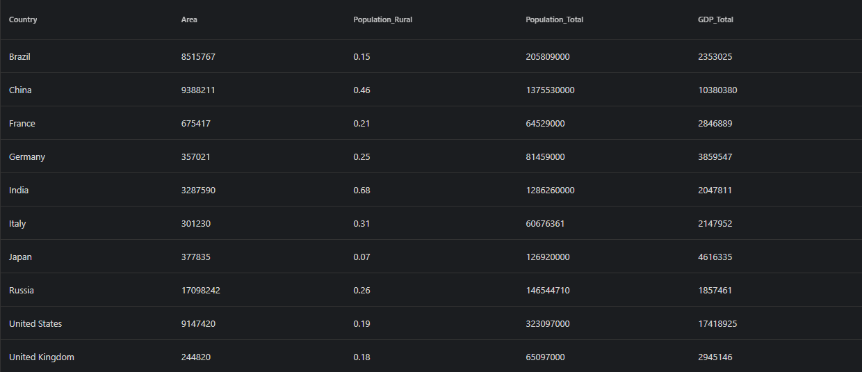
Demo source (Smart UI repo): react/source/table/basic/App.jsx
1 Create a Vite + React + TypeScript app
npm create vite@latest my-smart-app -- --template react-ts
cd my-smart-app
thennpm install
2 Install Smart UI for React
npm install smart-webcomponents-react
3 Import styles and render the component
Open src/App.tsx (or App.jsx if you chose JavaScript). The snippet below matches Smart UI React demos for this widget:
import 'smart-webcomponents-react/source/styles/smart.default.css';
import './App.css';
import React from "react";
import { Table } from 'smart-webcomponents-react/table';

const App = () => {

  return (
    <div>
      <div className="demo-description">
        Our Table web component can be used to wrap or replace standard Tables
        and add different styles, hover effects, sorting by one or multiple columns,
        add, remove and update rows.
      </div>
      <Table id="table">
        <table>
          <thead>
            <tr>
              <th scope="col">Country</th>
              <th scope="col">Area</th>
              <th scope="col">Population_Rural</th>
              <th scope="col">Population_Total</th>
              <th scope="col">GDP_Total</th>
            </tr>
          </thead>
          <tbody>
            <tr>
              <td>Brazil</td>
              <td>8515767</td>
              <td>0.15</td>
              <td>205809000</td>
              <td>2353025</td>
            </tr>
            <tr>
              <td>China</td>
              <td>9388211</td>
              <td>0.46</td>
              <td>1375530000</td>
              <td>10380380</td>
            </tr>
            <tr>
              <td>France</td>
              <td>675417</td>
              <td>0.21</td>
              <td>64529000</td>
              <td>2846889</td>
            </tr>
            <tr>
              <td>Germany</td>
              <td>357021</td>
              <td>0.25</td>
              <td>81459000</td>
              <td>3859547</td>
            </tr>
            <tr>
              <td>India</td>
              <td>3287590</td>
              <td>0.68</td>
              <td>1286260000</td>
              <td>2047811</td>
            </tr>
            <tr>
              <td>Italy</td>
              <td>301230</td>
              <td>0.31</td>
              <td>60676361</td>
              <td>2147952</td>
            </tr>
            <tr>
              <td>Japan</td>
              <td>377835</td>
              <td>0.07</td>
              <td>126920000</td>
              <td>4616335</td>
            </tr>
            <tr>
              <td>Russia</td>
              <td>17098242</td>
              <td>0.26</td>
              <td>146544710</td>
              <td>1857461</td>
            </tr>
            <tr>
              <td>United States</td>
              <td>9147420</td>
              <td>0.19</td>
              <td>323097000</td>
              <td>17418925</td>
            </tr>
            <tr>
              <td>United Kingdom</td>
              <td>244820</td>
              <td>0.18</td>
              <td>65097000</td>
              <td>2945146</td>
            </tr>
          </tbody>
        </table>
      </Table>
    </div>
  );
};

export default App;
4 Run the dev server
npm run dev
Open the URL Vite prints (often http://localhost:5173/).
Troubleshooting
- What is the difference between Grid and Table?
- Table is lighter-weight for simpler tabular data, while Grid provides advanced features like virtual scrolling, complex editing, and grouping.
TypeScript Support
Types ship with smart-webcomponents-react. Import the component and prop types:
import type { Table, TableProps } from 'smart-webcomponents-react/table';
The generated wrappers expose on* callbacks (for example onChange) whose arguments are standard DOM Event values unless the widget typings narrow them further.
Accessibility
The Table component follows WAI-ARIA best practices:
- Keyboard navigation - Tab, Arrow keys, Enter, and Escape are supported
- ARIA roles - Appropriate roles and labels are applied automatically
- Focus management - Visible focus indicators for keyboard users
- Screen readers - State changes are announced to assistive technology
- High contrast - Supports Windows High Contrast Mode and forced colors
For custom labeling, set aria-label or aria-labelledby attributes on the component.
Supported stacks: Smart UI targets Angular 17+, React 18+, Vue 3+, Node 18 LTS, and evergreen browsers; pin exact package versions to your org policy.