Getting Started with React CardView Component
Smart UI React targets React 18+ and current Node LTS for tooling; use TypeScript templates when you want typed props and events.
Demo source (Smart UI repo): react/source/cardview/overview/App.jsx
1 Create a Vite + React + TypeScript app
npm create vite@latest my-smart-app -- --template react-ts
cd my-smart-app
thennpm install
2 Install Smart UI for React
npm install smart-webcomponents-react
3 Import styles and render the component
Open src/App.tsx (or App.jsx if you chose JavaScript). The snippet below matches Smart UI React demos for this widget:
import 'smart-webcomponents-react/source/styles/smart.default.css';
import './App.css';
import React from "react";
import ReactDOM from 'react-dom/client';
import { CardView } from 'smart-webcomponents-react/cardview';
const App = () => {
const generateData = (length) => {
const sampleData = [],
firstNames = ['Andrew', 'Nancy', 'Shelley', 'Regina', 'Yoshi', 'Antoni', 'Mayumi', 'Ian', 'Peter', 'Lars', 'Petra', 'Martin', 'Sven', 'Elio', 'Beate', 'Cheryl', 'Michael', 'Guylene'],
lastNames = ['Fuller', 'Davolio', 'Burke', 'Murphy', 'Nagase', 'Saavedra', 'Ohno', 'Devling', 'Wilson', 'Peterson', 'Winkler', 'Bein', 'Petersen', 'Rossi', 'Vileid', 'Saylor', 'Bjorn', 'Nodier'],
petNames = ['Sam', 'Bob', 'Lucky', 'Tommy', 'Charlie', 'Olliver', 'Mixie', 'Fluffy', 'Acorn', 'Beak'],
countries = ['Bulgaria', 'USA', 'UK', 'Singapore', 'Thailand', 'Russia', 'China', 'Belize'],
productNames = ['Black Tea', 'Green Tea', 'Caffe Espresso', 'Doubleshot Espresso', 'Caffe Latte', 'White Chocolate Mocha', 'Cramel Latte', 'Caffe Americano', 'Cappuccino', 'Espresso Truffle', 'Espresso con Panna', 'Peppermint Mocha Twist'];
for (let i = 0; i < length; i++) {
const row = {};
row.firstName = firstNames[Math.floor(Math.random() * firstNames.length)];
row.lastName = lastNames[Math.floor(Math.random() * lastNames.length)];
row.birthday = new Date(Math.round(Math.random() * (2018 - 1918) + 1918), Math.round(Math.random() * 11), Math.round(Math.random() * (31 - 1) + 1));
row.petName = petNames[Math.floor(Math.random() * petNames.length)];
row.country = countries[Math.floor(Math.random() * countries.length)];
row.productName = productNames[Math.floor(Math.random() * productNames.length)];
row.price = parseFloat((Math.random() * (100 - 0.5) + 0.5).toFixed(2));
row.quantity = Math.round(Math.random() * (50 - 1) + 1);
row.timeOfPurchase = new Date(2019, 0, 1, Math.round(Math.random() * 23), Math.round(Math.random() * (31 - 1) + 1));
row.expired = Math.random() >= 0.5;
row.attachments = [];
const maxAttachments = Math.floor(Math.random() * Math.floor(3)) + 1;
for (let i = 0; i < maxAttachments; i++) {
row.attachments.push(`https://www.htmlelements.com/demos//images/travel/${Math.floor(Math.random() * 36) + 1}.jpg`);
}
row.attachments = row.attachments.join(',');
sampleData[i] = row;
}
return sampleData;
}
const columns = [{
label: 'First Name',
dataField: 'firstName',
icon: 'firstName'
},
{
label: 'Last Name',
dataField: 'lastName',
icon: 'lastName'
},
{
label: 'Birthday',
dataField: 'birthday',
icon: 'birthday',
formatSettings: {
formatString: 'd'
}
},
{
label: 'Pet Name',
dataField: 'petName',
icon: 'petName'
},
{
label: 'Country',
dataField: 'country',
icon: 'country'
},
{
label: 'Product Name',
dataField: 'productName',
icon: 'productName'
},
{
label: 'Price',
dataField: 'price',
icon: 'price',
formatSettings: {
formatString: 'c2'
}
},
{
label: 'Quantity',
dataField: 'quantity',
icon: 'quantity',
formatFunction: function (settings) {
const value = settings.value;
let className;
if (value < 20) {
className = 'red';
} else if (value < 35) {
className = 'yellow';
} else {
className = 'green';
}
settings.template = `<div class="${className}">${value}</div>`;
}
},
{
label: 'Time of Purchase',
dataField: 'timeOfPurchase',
icon: 'timeOfPurchase',
formatSettings: {
formatString: 'hh:mm tt'
}
},
{
label: 'Expired',
dataField: 'expired',
icon: 'expired',
formatFunction: function (settings) {
settings.template = settings.value ? '☑' : '☐';
}
},
{
label: 'Attachments',
dataField: 'attachments',
image: true
}
];
const dataSource = generateData(50);
const dataSourceSettings = {
dataFields: [
'firstName: string',
'lastName: string',
'birthday: date',
'petName: string',
'country: string',
'productName: string',
'price: number',
'quantity: number',
'timeOfPurchase: date',
'expired: boolean',
'attachments: string'
]
};
return (
<div>
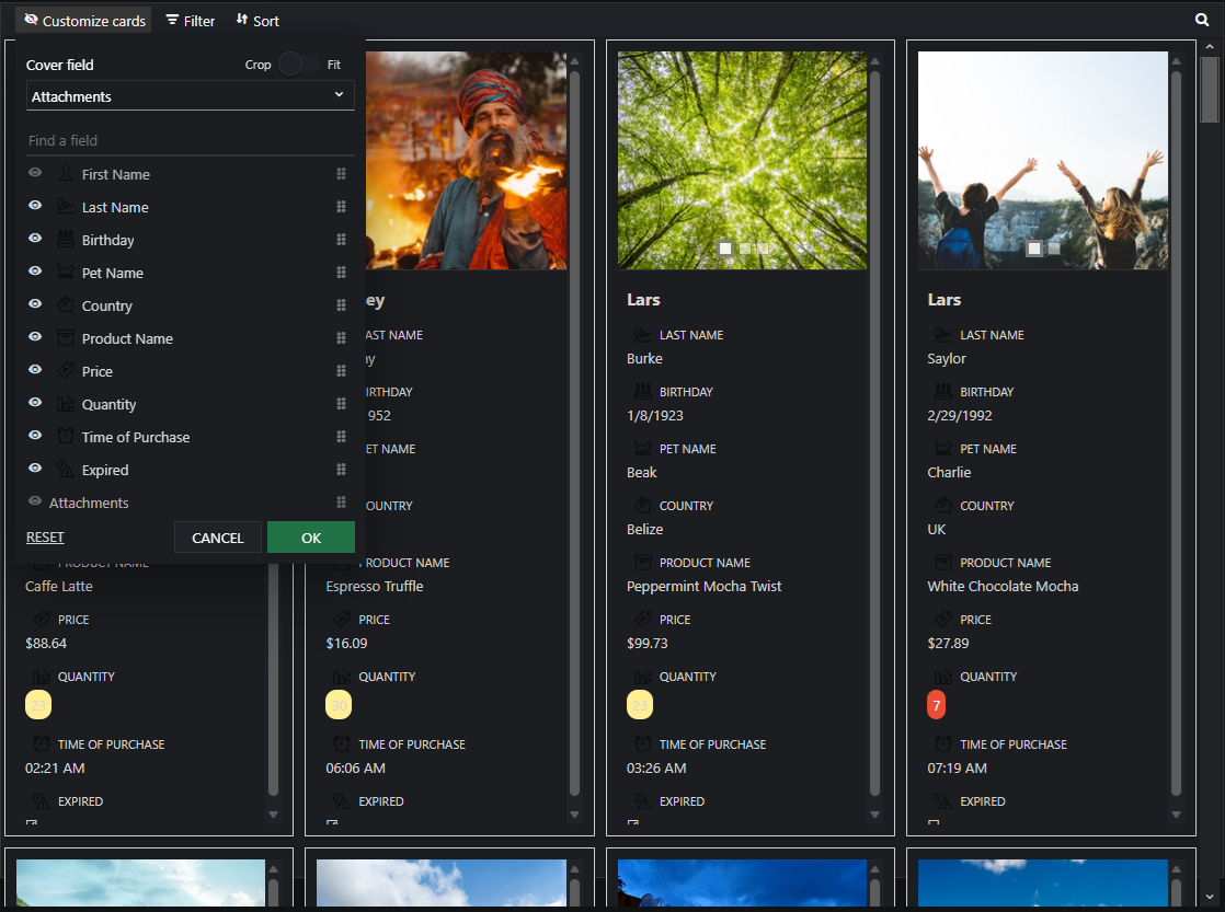
<div className="demo-description">In Card View, data source records are represented as cards. Each Card
contain content and actions about a single subject. smartCardView supports
data sort, data filtering, data editing, data grouping and data searching.</div>
<CardView
coverField="attachments"
titleField="firstName"
id="cardView"
dataSourceSettings={dataSourceSettings}
dataSource={dataSource}
columns={columns}
>
</CardView>
</div>
);
}
export default App;
4 Run the dev server
npm run dev
Open the URL Vite prints (often http://localhost:5173/).
Common Use Cases
-
Configure card layout
Set columns and cover image field
cardView.coverField = 'image';
cardView.titleField = 'name';
-
Handle card click
Respond when user clicks a card
cardView.addEventListener('itemClick', (e) => {
  console.log('Card data:', e.detail.data);
});
Troubleshooting
- How do I customize card templates?
- Use the cardTemplate property to define a custom HTML template with data bindings.
TypeScript Support
Types ship with smart-webcomponents-react. Import the component and prop types:
import type { CardView, CardViewProps } from 'smart-webcomponents-react/cardview';
The generated wrappers expose on* callbacks (for example onChange) whose arguments are standard DOM Event values unless the widget typings narrow them further.
Accessibility
The CardView component follows WAI-ARIA best practices:
- Keyboard navigation - Tab, Arrow keys, Enter, and Escape are supported
- ARIA roles - Appropriate roles and labels are applied automatically
- Focus management - Visible focus indicators for keyboard users
- Screen readers - State changes are announced to assistive technology
- High contrast - Supports Windows High Contrast Mode and forced colors
For custom labeling, set aria-label or aria-labelledby attributes on the component.
Supported stacks: Smart UI targets Angular 17+, React 18+, Vue 3+, Node 18 LTS, and evergreen browsers; pin exact package versions to your org policy.