Chart for Angular
Angular standalone version of this topic (compatible with Angular 17+). Import both the Smart UI component and module in the standalone component.
What this topic covers: practical setup, the framework-specific API access pattern, and copy-adapt guidance for the examples in this page.
import { Component, ViewChild, ViewEncapsulation } from '@angular/core';
import { CommonModule } from '@angular/common';
import { RouterOutlet } from '@angular/router';
import { ChartComponent, ChartModule } from 'smart-webcomponents-angular/chart';

@Component({
  selector: 'app-root',
  standalone: true,
  imports: [CommonModule, ChartModule, RouterOutlet],
  templateUrl: './app.component.html',
  styleUrls: ['./app.component.css'],
  encapsulation: ViewEncapsulation.None
})
export class AppComponent {
  @ViewChild('chart', { read: ChartComponent, static: false }) chart!: ChartComponent;
}
<!-- app.component.html -->
<smart-chart #chart></smart-chart>
Use this.chart for API methods in this topic.
Chart Styling
Build your web apps using Smart UI
Smart.Chart - styling configuration and usage
Chart Styling
Smart.Chart offers many options to customize the chart appearance and colors. In this section we will go through the styling options available in different chart elements.
Themes
Smart.Chart themes are sets of background, line, text and band colors that will be used in the Chart by default, if no further customizations are made. There are two themes - 'light' (default) and 'dark' that can be applied by setting the theme property.
The following images show the same Chart with 'light' and 'dark' theme respectively:

|
|

|
|
| theme: 'light' | theme: 'dark' |
Color Schemes
Smart.Chart also ships with 32 built-in color schemes which are used to automatically set colors for different series. You can change the color scheme by setting the colorScheme property of the chart. The available value are from 'scheme01' to 'scheme32'.
The following images show the same Chart with two different color schemes applied:

|
|

|
|
| colorScheme: 'scheme28' | colorScheme: 'scheme29' |
Custom color schemes can also be applied by adding them with the addColorScheme method:
const chart = this.chart;
this.chart.addColorScheme('myScheme', ['#1A6642', '#46C26F', '#F9B956', '#F38443', '#DE513D']);
this.chart.colorScheme = 'myScheme';
Custom Series Colors
Series colors can be furter customized via the following series properties:
- fillColor - fill color for the serie.
- fillColorSelected - fill color for the serie when selected.
- fillColorAlt - alternating fill color for the serie. Applicable to OHLC series only.
- fillColorAltSelected - alternating fill color for the serie when selected. Applicable to OHLC series only.
- fillColorSymbol - fill color for the marker symbols in the serie.
- fillColorSymbolSelected - fill color for the the marker symbols in serie when selected.
- legendFillColor - fill color of the legend box. The default value is inherited from the serie's color.
- legendLineColor - line color of the legend box. The default value is inherited from the serie's color.
- lineColor - line color for the serie.
- lineColorSelected - line color for the serie when selected.
- lineColorSymbol - line color for the marker symbols in serie.
- lineColorSymbolSelected - line color for the marker symbols in the serie when selected.
- toolTipLineColor - determines the tooltip's border lines color.
- useGradientColors - determines whether to use color gradients.
Conditional colors can also be applied by implementing the callback function colorFunction.
In the following example, some of these settings are demonstrated:
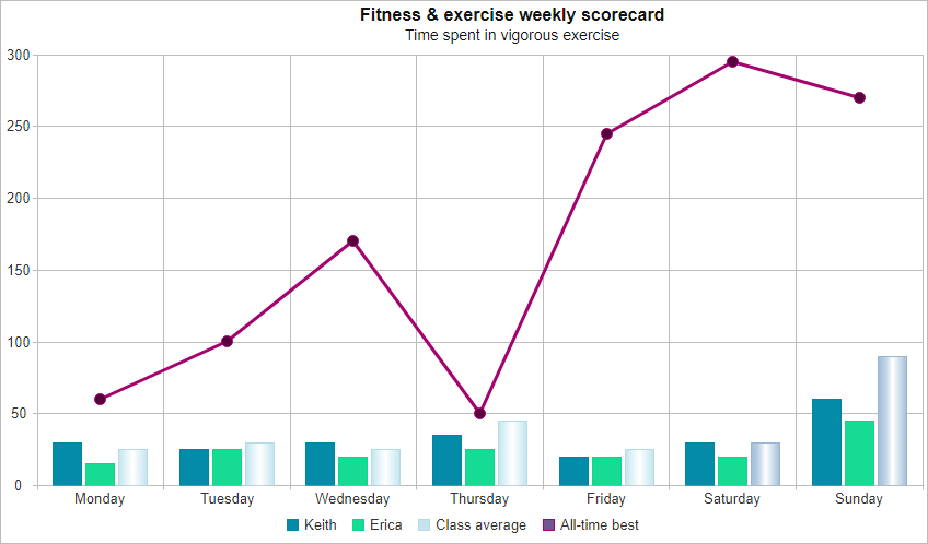
componentProps = {
                    caption: 'Fitness & exercise weekly scorecard',
                    description: 'Time spent in vigorous exercise',
                    showLegend: true,
                    padding: { left: 5, top: 5, right: 5, bottom: 5 },
                    titlePadding: { left: 90, top: 0, right: 0, bottom: 10 },
                    dataSource: sampleData,
                    xAxis:
                    {
                        dataField: 'Day',
                        gridLines: {
                            visible: true
                        },
                        valuesOnTicks: false
                    },
                    valueAxis:
                    {
                        description: 'Time in minutes',
                        axisSize: 'auto',
                        tickMarksColor: '#888888'
                    },
                    seriesGroups:
                        [
                            {
                                type: 'column',
                                series: [
                                    { dataField: 'Keith', displayText: 'Keith', fillColor: '#048BA8' },
                                    { dataField: 'Erica', displayText: 'Erica', fillColor: '#16DB93' },
                                    {
                                        dataField: 'Average', displayText: 'Class average', useGradientColors: true,
                                        colorFunction: function (value, index) {
                                            if (isNaN(value)) {
                                                return '#C6E2E9';
                                            }

                                            return index < 5 ? '#C6E2E9' : '#A7BED3';
                                        }
                                    }
                                ]
                            },
                            {
                                type: 'stackedline',
                                series: [
                                    { dataField: 'Best', displayText: 'All-time best', symbolType: 'circle', symbolSize: 10, fillColorSymbol: '#56013D', lineColor: '#A4036F' }
                                ]
                            }
                        ]
                };

// app.component.html
// <smart-chart #chart [dataSource]="componentProps.dataSource" [columns]="componentProps.columns"></smart-chart>
Grid lines
You can adjust the spacing and colors of the horizontal and vertical grid lines. The vertical gridlines can be adjusted by changing the xAxis.gridLines options. For example the following code makes the vertical grid lines visible, makes their color blue and sets the spacing between the lines such that a line appears once for every tenth element:
xAxis:
{
    gridLines: {
        visible: true,
        color: '#0000FF',
        step: 10
    }
}
The horizontal grid lines can be changed by setting the valueAxis.gridLines options.
Tick marks
Tick marks and grid lines work in a very similar way and Smart.Chart offers identical properties.
To change the tick marks across the horizontal axis use the xAxis.tickMarks options:
xAxis:
{
    tickMarks: {
        visible: true,
        color: '#0000FF',
        step: 2
    }
}
The valueAxis.tickMarks options control the appearance of the value axis tick marks.
Border Line Color, Background Color, and Background Image
You can change the chart's border color by setting the borderLineColor property:
const chart = this.chart;
this.chart.borderLineColor = '#0000FF';
The chart's default background color can be changed by setting the backgroundColor property:
const chart = this.chart;
this.chart.backgroundColor = '#97D1E5';
Instead of using background color you can use an image by setting backgroundImage:
const chart = this.chart;
this.chart.backgroundImage = '../images/chart_background.png';
Styling Through CSS
Some parts of Smart.Chart can be styled through CSS. Here is an overview:
CSS variables for Chart styling:
- --smart-font-family - font-family of text in the Chart.
- --smart-font-size - font-size of caption text. The font-size of all other text parts is also relative to this variable.
- --smart-border-radius - border-radius of the Chart's tooltip.
The following CSS selectors can be used to style Smart.Chart:
-
smart-chart - applied to the whole Chart element.
-
.smart-container - applied to the container that holds all internal elements of the Chart.
- .smart-chart-title-text - applied to the Chart's caption (title).
- .smart-chart-title-description - applied to the Chart's description.
- .smart-chart-axis-description - applied to axis descriptions.
- .smart-chart-axis-text - applied to axis labels.
- .smart-chart-label-text - applied to series labels.
- .smart-chart-legend-text - applied to legend text.
- .smart-chart-annotation-text - applied to annotation text.
- .smart-chart-range-selector - applied to the Chart's range selector.
-
.smart-chart-tooltip - applied to the Chart's tooltip.
-
.smart-chart-tooltip-content - applied to the tooltip's content container.
- .smart-chart-tooltip-text - applied to the tooltip's text.
-
.smart-chart-tooltip-content - applied to the tooltip's content container.
-
.smart-container - applied to the container that holds all internal elements of the Chart.
Live Example
The following live example demonstrates many of the functionalities described in this tutorial:
componentProps = {
                    borderLineColor: '#808080',
                    backgroundImage: '../../../documentation/images/chart-custom-element-background.png',
                    caption: 'Wind Speed',
                    description: 'around the world',
                    showLegend: true,
                    padding: { left: 5, top: 5, right: 5, bottom: 5 },
                    titlePadding: { left: 90, top: 0, right: 0, bottom: 10 },
                    dataSource: sampleData,
                    xAxis:
                    {
                        dataField: 'Day',
                        gridLines: {
                            visible: true,
                            color: '#404040',
                            step: 1
                        },
                        tickMarks: {
                            visible: true,
                            color: '#000000',
                            step: 2
                        },
                        valuesOnTicks: false
                    },
                    valueAxis:
                    {
                        description: 'Time in minutes',

                        gridLines: {
                            visible: true,
                            color: '#404040',
                            step: 2
                        },
                        tickMarks: {
                            visible: true,
                            color: '#000000',
                            step: 1
                        },
                        axisSize: 'auto',
                        tickMarksColor: '#888888'
                    },
                    seriesGroups:
                        [
                            {
                                type: 'column',
                                useGradientColors: true,
                                series: [
                                    { dataField: 'Sofia', fillColor: '#048BA8' },
                                    { dataField: 'Bruges', fillColor: '#16DB93' }
                                ]
                            },
                            {
                                type: 'stackedline',
                                series: [
                                    { dataField: 'Oklahoma City', symbolType: 'circle', symbolSize: 10, fillColorSymbol: '#3587CE', fillColor: '#3587CE', lineColor: '#0459A8' }
                                ]
                            }
                        ]
                };

// app.component.html
// <smart-chart #chart [dataSource]="componentProps.dataSource" [columns]="componentProps.columns"></smart-chart>
For AI tooling
Developer Quick Reference
Topic: chart-styling Component: Chart Framework: Angular
Main methods: addColorScheme()
Common config keys: dataSource
Implementation Notes
Compatibility: Angular 17+ (standalone) API access pattern: @ViewChild(...) + this.component.method()
Lifecycle guidance: Bind inputs declaratively and call imperative API through @ViewChild in/after ngAfterViewInit.
Common pitfalls:
- Using @ViewChild API too early (before view init).
- Omitting standalone imports for Smart modules in @Component.imports.
- Type mismatches between configuration fields and template bindings.
Validation checklist:
- Ensure module import exists in standalone component imports array.
- Use typed @ViewChild(..., { read: ComponentType }).
- Call imperative methods after view initialization.