Getting Started with React GanttChart Component
Smart UI React targets React 18+ and current Node LTS for tooling; use TypeScript templates when you want typed props and events.
Demo source (Smart UI repo): react/source/gantt/overview/App.jsx
1 Create a Vite + React + TypeScript app
npm create vite@latest my-smart-app -- --template react-ts
cd my-smart-app
thennpm install
2 Install Smart UI for React
npm install smart-webcomponents-react
3 Import styles and render the component
Open src/App.tsx (or App.jsx if you chose JavaScript). The snippet below matches Smart UI React demos for this widget:
import 'smart-webcomponents-react/source/styles/smart.default.css';
import './App.css';
import { GanttChart } from 'smart-webcomponents-react/ganttchart';
const App = () => {
const treeSize = '30%';
const durationUnit = 'hour';
const taskColumns = [
{
label: 'Tasks',
value: 'label',
size: '60%'
},
{
label: 'Duration (hours)',
value: 'duration',
formatFunction: (date) => parseInt(date)
}
];
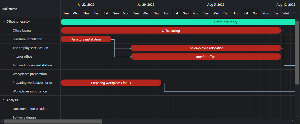
const dataSource = [
{
label: 'PRD & User-Stories',
dateStart: '2021-01-10',
dateEnd: '2021-03-10',
class: 'product-team',
type: 'task'
},
{
label: 'Persona & Journey',
dateStart: '2021-03-01',
dateEnd: '2021-04-30',
class: 'marketing-team',
type: 'task'
},
{
label: 'Architecture',
dateStart: '2021-04-11',
dateEnd: '2021-05-16',
class: 'product-team',
type: 'task'
},
{
label: 'Prototyping',
dateStart: '2021-05-17',
dateEnd: '2021-07-01',
class: 'dev-team',
type: 'task'
},
{
label: 'Design',
dateStart: '2021-07-02',
dateEnd: '2021-08-01',
class: 'design-team',
type: 'task'
},
{
label: 'Development',
dateStart: '2021-08-01',
dateEnd: '2021-09-10',
class: 'dev-team',
type: 'task'
},
{
label: 'Testing & QA',
dateStart: '2021-09-11',
dateEnd: '2021-10-10',
class: 'qa-team',
type: 'task'
},
{
label: 'UAT Test',
dateStart: '2021-10-12',
dateEnd: '2021-11-11',
class: 'product-team',
type: 'task'
},
{
label: 'Handover & Documentation',
dateStart: '2021-10-17',
dateEnd: '2021-11-31',
class: 'marketing-team',
type: 'task'
},
{
label: 'Release',
dateStart: '2021-11-01',
dateEnd: '2021-12-31',
class: 'release-team',
type: 'task'
}
];
return (
<div>
<GanttChart
dataSource={dataSource}
taskColumns={taskColumns}
treeSize={treeSize}
durationUnit={durationUnit}
id="gantt"
></GanttChart>
</div>
);
}
export default App;
4 Run the dev server
npm run dev
Open the URL Vite prints (often http://localhost:5173/).
Common Use Cases
-
Load tasks from JSON
Populate Gantt chart with task data
gantt.dataSource = tasksArray;
-
Add task dependencies
Link tasks with predecessor relationships
gantt.dataSource = [{ label: 'Task 1', dateStart: '2026-01-01', dateEnd: '2026-01-05' }, { label: 'Task 2', dateStart: '2026-01-06', dateEnd: '2026-01-10', connections: [{ target: 0, type: 1 }] }]; -
Export to PDF
Generate a PDF of the Gantt chart
gantt.exportData('pdf', 'GanttExport');
Troubleshooting
- Why are my task dependencies not showing?
- Ensure connections array in each task uses valid target indices and connection type values. Type 0 = start-to-start, 1 = end-to-start.
- How do I change the time scale?
- Set durationUnit to 'hour', 'day', 'week', or 'month' and configure view settings accordingly.
TypeScript Support
Types ship with smart-webcomponents-react. Import the component and prop types:
import type { GanttChart, GanttChartProps } from 'smart-webcomponents-react/ganttchart';
The generated wrappers expose on* callbacks (for example onChange) whose arguments are standard DOM Event values unless the widget typings narrow them further.
Accessibility
The GanttChart component follows WAI-ARIA best practices:
- Keyboard navigation - Tab, Arrow keys, Enter, and Escape are supported
- ARIA roles - Appropriate roles and labels are applied automatically
- Focus management - Visible focus indicators for keyboard users
- Screen readers - State changes are announced to assistive technology
- High contrast - Supports Windows High Contrast Mode and forced colors
For custom labeling, set aria-label or aria-labelledby attributes on the component.
Supported stacks: Smart UI targets Angular 17+, React 18+, Vue 3+, Node 18 LTS, and evergreen browsers; pin exact package versions to your org policy.