Grid for React
React version of this topic (compatible with React 19+). Keep the same configuration logic from JavaScript and pass it as component props.
What this topic covers: Focuses on reliable data export workflows (xlsx/csv/pdf/json), what gets exported from current grid state, and how to tune export options for business reporting.
import React, { useMemo, useRef } from 'react';
import { Grid } from 'smart-webcomponents-react/grid';
import 'smart-webcomponents-react/source/styles/smart.default.css';

export default function App() {
  const componentRef = useRef(null);
  const componentProps = useMemo(() => ({
    // Copy this topic's JavaScript configuration here.
  }), []);

  return <Grid ref={componentRef} {...componentProps}></Grid>;
}
Use componentRef.current for API methods in this topic.
Export data
The Grid data can be exported to 'Excel', 'CSV', 'TSV', 'XML', 'PDF' and 'JSON'. The data export exports the grid as it is currently rendered i.e it will take into account whether you have applied sorting, filtering, grouping. Columns which are hidden i.e column.visible = false, will not be exported. If you want to disable the export of a column which is visible, you can use theallowExport column property i.e column.allowExport = false.
The Grid exports the raw data values which means that custom cell renderers and cell styles will not be included in the export.
To export Grid data, you can use the
exportData method.
componentRef.current.exportData('xlsx');
You can customize the export by using the dataExport property.
Disable the column headers export.
dataExport.header = false;
Set the page orientation when exporting to 'pdf'. Accepted values are 'portrait' and 'landscape'.
dataExport.pageOrientation = 'landscape';
Restrict the export to specific range of rows.
dataExport.view = true; dataExport.viewStart = 1; dataExport.viewEnd = 10;
Restrict the export to specific rows.
dataExport.rowIds = [0, 5, 15];
Set export's file name.
dataExport.fileName = 'myFile';
Custom Style
By default the Grid exports the data using the background, color, font style and font names from its Theme. By using thedataExport.style property, it is possible
to customize that style.
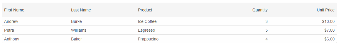
Let's create a Grid instance with the following setup:
const componentProps = {
dataSourceSettings: {
dataFields: [
{ name: 'firstName', dataType: 'string' },
{ name: 'lastName', dataType: 'string' },
{ name: 'productName', map: 'product.name', dataType: 'string' },
{ name: 'quantity', map: 'product.quantity', dataType: 'number' },
{ name: 'price', map: 'product.price', dataType: 'number' },
{ name: 'total', map: 'product.total', dataType: 'number' }
]
},
layout: {
allowCellsWrap: true,
rowHeight: 'auto'
},
behavior: {
columnResizeMode: 'growAndShrink'
},
sorting: {
enabled: true
},
dataSource: [
{
firstName: 'Andrew',
lastName: 'Burke',
product: {
name: 'Ice Coffee', price: 10, quantity: 3, total: 30
}
},
{
firstName: 'Petra',
lastName: 'Williams',
product: {
name: 'Espresso', price: 7, quantity: 5, total: 35
}
},
{
firstName: 'Anthony',
lastName: 'Baker',
product: {
name: 'Frappucino', price: 6, quantity: 4, total: 24
}
}
],
columns: [
{
label: 'First Name', dataField: 'firstName'
},
{ label: 'Last Name', dataField: 'lastName' },
{ label: 'Product', dataField: 'productName' },
{
label: 'Quantity', dataField: 'quantity', cellsAlign: 'right'
},
{ label: 'Unit Price', dataField: 'price', cellsAlign: 'right', cellsFormat: 'c2' }
]
}
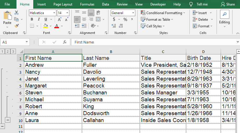
const grid = new Smart.Grid("#grid", gridOptions);
By calling
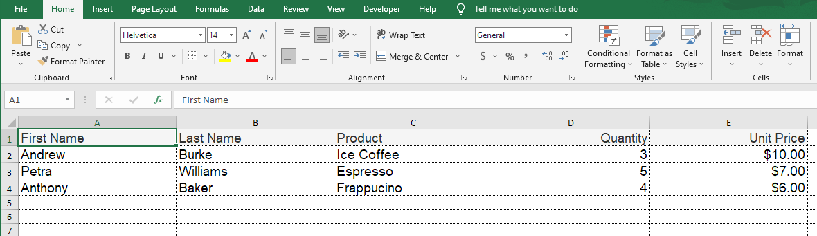
componentRef.current.exportData('xlsx');, we will get the following output:
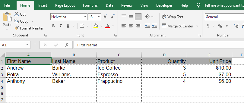
Now, if we apply the following custom style which sets custom border color, font family, font size, font weight, color, background color, cell formatting, etc. to the grid headers, rows and cells.
componentRef.current.dataExport.style = {
	border: '1px solid #bbbbbb',
	borderCollapse: 'collapse',
	header: {
		height: '30px',
		border: '1px solid #bbbbbb',
		fontFamily: 'Helvetica',
		fontSize: '13px',
		color: '#000000',
		backgroundColor: '#aaaaaa',
		fontWeight: '400',
		firstName: {
			width: '150px'
		},
		lastName: {
			width: '150px'
		},
		productName: {
			width: '150px'
		},
		quantity: {
			textAlign: 'right',
			width: '150px'
		},
		price: {
			textAlign: 'right',
			format: 'c2',
			width: '150px'
		}
	},
	columns: {
		border: '1px solid #bbbbbb',
		fontFamily: 'Helvetica',
		fontSize: '13px',
		quantity: {
			textAlign: 'right'
		},
		price: {
			textAlign: 'right',
			format: 'c2'
		}
	},
	rows: {
		height: '30px'
	}
}
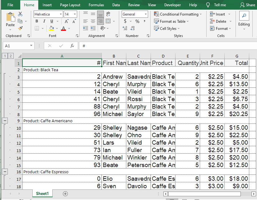
Excel Export with Grouping
The Grid maintains the groups and in Excel you still will be able to expand/collapse the groups.Let's look at the following code taken from: data export with grouping sample.
const componentProps = {
	dataSource: new Smart.DataAdapter(
	{
		dataSource: generateData(100),
		groupBy: ['productName'],
		dataFields:
			[
				'id: number',
				'firstName: string',
				'lastName: string',
				'productName: string',
				'quantity: number',
				'price: number',
				'total: number'
			]
	}),
	grouping: {
		enabled: true
	},
	columns: [
		{
			label: '#', width: 200, dataField: 'id'
		},
		{
			label: 'First Name', dataField: 'firstName'
		},

		{ label: 'Last Name', dataField: 'lastName' },
		{ label: 'Product', dataField: 'productName' },
		{ label: 'Quantity', dataField: 'quantity', align: 'right', cellsAlign: 'right', },
		{ label: 'Unit Price', dataField: 'price', align: 'right', cellsAlign: 'right', cellsFormat: 'c2' },
		{
			label: 'Total', dataField: 'total', align: 'right', cellsAlign: 'right', cellsFormat: 'c2'
		}
	]
}
Excel export with Tree Grid
The Grid maintains the Tree hierarchy and in Excel you still will be able to expand/collapse the tree grid rows.Let's look at the following code taken from: data export with tree grid sample.
const componentProps = {
	dataSource: new Smart.DataAdapter(
	{
		dataSource: [
			{ "EmployeeID": 1, "FirstName": "Nancy", "LastName": "Davolio", "ReportsTo": 2, "Country": "USA", "Title": "Sales Representative", "HireDate": "1992-05-01 00:00:00", "BirthDate": "1948-12-08 00:00:00", "City": "Seattle", "Address": "507 - 20th Ave. E.Apt. 2A" },
			{ "EmployeeID": 2, "FirstName": "Andrew", "LastName": "Fuller", "ReportsTo": null, "Country": "USA", "Title": "Vice President, Sales", "HireDate": "1992-08-14 00:00:00", "BirthDate": "1952-02-19 00:00:00", "City": "Tacoma", "Address": "908 W. Capital Way" },
			{ "EmployeeID": 3, "FirstName": "Janet", "LastName": "Leverling", "ReportsTo": 2, "Country": "USA", "Title": "Sales Representative", "HireDate": "1992-04-01 00:00:00", "BirthDate": "1963-08-30 00:00:00", "City": "Kirkland", "Address": "722 Moss Bay Blvd." },
			{ "EmployeeID": 4, "FirstName": "Margaret", "LastName": "Peacock", "ReportsTo": 2, "Country": "USA", "Title": "Sales Representative", "HireDate": "1993-05-03 00:00:00", "BirthDate": "1937-09-19 00:00:00", "City": "Redmond", "Address": "4110 Old Redmond Rd." },
			{ "EmployeeID": 5, "FirstName": "Steven", "LastName": "Buchanan", "ReportsTo": 2, "Country": "UK", "Title": "Sales Manager", "HireDate": "1993-10-17 00:00:00", "BirthDate": "1955-03-04 00:00:00", "City": "London", "Address": "14 Garrett Hill" },
			{ "EmployeeID": 6, "FirstName": "Michael", "LastName": "Suyama", "ReportsTo": 5, "Country": "UK", "Title": "Sales Representative", "HireDate": "1993-10-17 00:00:00", "BirthDate": "1963-07-02 00:00:00", "City": "London", "Address": "Coventry House Miner Rd." },
			{ "EmployeeID": 7, "FirstName": "Robert", "LastName": "King", "ReportsTo": 5, "Country": "UK", "Title": "Sales Representative", "HireDate": "1994-01-02 00:00:00", "BirthDate": "1960-05-29 00:00:00", "City": "London", "Address": "Edgeham Hollow Winchester Way" },
			{ "EmployeeID": 8, "FirstName": "Laura", "LastName": "Callahan", "ReportsTo": 2, "Country": "USA", "Title": "Inside Sales Coordinator", "HireDate": "1994-03-05 00:00:00", "BirthDate": "1958-01-09 00:00:00", "City": "Seattle", "Address": "4726 - 11th Ave. N.E." },
			{ "EmployeeID": 9, "FirstName": "Anne", "LastName": "Dodsworth", "ReportsTo": 5, "Country": "UK", "Title": "Sales Representative", "HireDate": "1994-11-15 00:00:00", "BirthDate": "1966-01-27 00:00:00", "City": "London", "Address": "7 Houndstooth Rd." }
		],
		keyDataField: 'EmployeeID',
		parentDataField: 'ReportsTo',
		id: 'EmployeeID',
		dataFields:
			[
				'EmployeeID: number',
				'ReportsTo: number',
				'FirstName: string',
				'LastName: string',
				'Country: string',
				'City: string',
				'Address: string',
				'Title: string',
				 'HireDate: date',
				'BirthDate: date'
			]
	}),
	onRowInit: function(index, row) {
		if (row.id === 2) {
			row.expanded = true;
		}
	},
	columns: [
		{ label: 'First Name', dataField: 'FirstName', width: 200 },
		{ label: 'Last Name', dataField: 'LastName', width: 200 },
		{ label: 'Title', dataField: 'Title', width: 160 },
		{ label: 'Birth Date', dataField: 'BirthDate', cellsFormat: 'd', width: 120 },
		{ label: 'Hire Date', dataField: 'HireDate', cellsFormat: 'd', width: 120 },
		{ label: 'Address', dataField: 'Address', width: 250 },
		{ label: 'City', dataField: 'City', width: 120 },
		{ label: 'Country', dataField: 'Country' }
	]
}
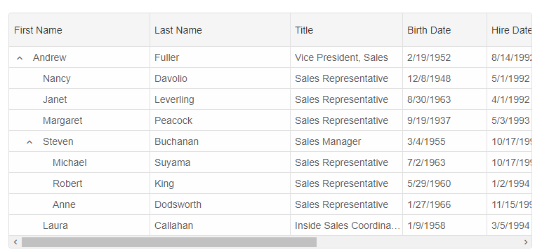
The output in Excel would be:
For AI tooling
Developer Quick Reference
Topic: grid-export Component: Grid Framework: React
Main methods: exportData()
Common config keys: layout, behavior, sorting, dataSource, columns, header, grouping
Implementation Notes
Compatibility: React 19+ API access pattern: const componentRef = useRef(null) + componentRef.current.method()
Lifecycle guidance: Use useMemo for large config objects and call imperative API through componentRef.current after first render.
Common pitfalls:
- Recreating columns/dataSource objects on every render can reset component state.
- Calling API methods before ref is available causes runtime errors.
- Mixing controlled and imperative updates without sync can lead to stale UI.
Validation checklist:
- Keep config objects memoized when possible.
- Guard API calls with ref existence checks.
- Verify CSS theme import is present once per app.