Grid for Angular
Angular standalone version of this topic (compatible with Angular 17+). Import both the Smart UI component and module in the standalone component.
What this topic covers: practical setup, the framework-specific API access pattern, and copy-adapt guidance for the examples in this page.
import { Component, ViewChild, ViewEncapsulation } from '@angular/core';
import { CommonModule } from '@angular/common';
import { RouterOutlet } from '@angular/router';
import { GridComponent, GridModule } from 'smart-webcomponents-angular/grid';

@Component({
  selector: 'app-root',
  standalone: true,
  imports: [CommonModule, GridModule, RouterOutlet],
  templateUrl: './app.component.html',
  styleUrls: ['./app.component.css'],
  encapsulation: ViewEncapsulation.None
})
export class AppComponent {
  @ViewChild('grid', { read: GridComponent, static: false }) grid!: GridComponent;
}
<!-- app.component.html -->
<smart-grid #grid></smart-grid>
Use this.grid for API methods in this topic.
Row Styling
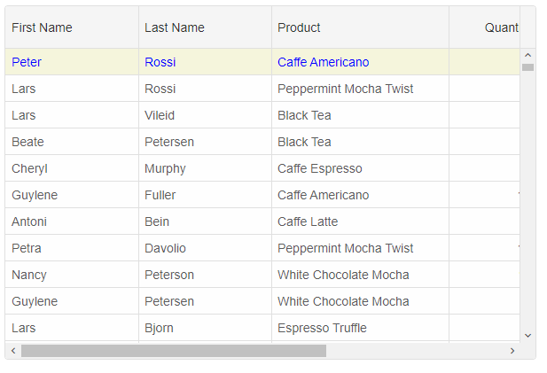
To style entire row you can use thesetRowStyle method, onRowClass function and the highlightRow method.
setRowStyle function
ThesetRowStyle method expects two arguments - rowID and rowStyle object. The rowStyle object may have one or all of the following properties: 'background', 'color', 'fontSize', 'fontFamily', 'textDecoration', 'fontStyle', 'fontWeight'.
this.grid.setRowStyle(0, {
	background: 'beige',
	color: 'blue'
});
onRowClass function
Alternatively, by using theonRowClass function you can dynamically apply a CSS class(es) to an entire row. onRowClass should return a CSS class name string or an array of CSS class names divided by space.
.row-class-1{
	background: beige;
	color: yellowgreen;
}
.row-class-2 {
	background: aquamarine;
	color: yellow;
}
componentProps = {
    behavior: { columnResizeMode: 'growAndShrink' },
    dataSource: new Smart.DataAdapter({
        dataSource: Data,
        dataFields: [
            'id: number',
            'firstName: string',
            'lastName: string',
            'productName: string',
            'quantity: number',
            'price: number',
            'total: number'
        ]
    }),
    editing: {
        enabled: true
    },
    selection: {
        enabled: true,
        allowCellSelection: true,
        allowRowHeaderSelection: true,
        allowColumnHeaderSelection: true,
        mode: 'extended'
    },
    onLoad: () => {
        this.grid.setRowStyle(0, {
            background: 'beige',
            color: 'blue'
        });
    },
    onRowClass(index, data, row) {
        if (index % 2 === 0) {
            return 'row-class-1'
        }
        if (data.firstName === 'Andrew') {
            return 'row-class-2';
        }
    },
    columns: [
        {
            label: 'First Name', width: 150, dataField: 'firstName'
        },
        { label: 'Last Name', width: 150, dataField: 'lastName' },
        { label: 'Product', width: 200, dataField: 'productName' },
        { label: 'Quantity', width: 100, dataField: 'quantity' },
        { label: 'Unit Price', width: 100, dataField: 'price', cellsFormat: 'c2' },
        { label: 'Total', dataField: 'total', width: 200, cellsFormat: 'c2' }
    ]
};
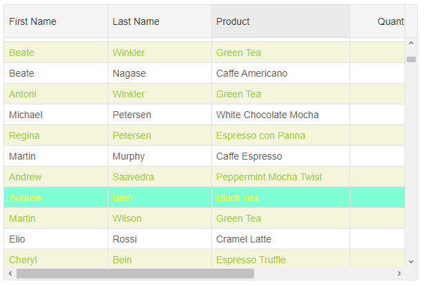
highlightRow function
To apply a CSS class to a row, you can also use thehighlightRow method.
this.grid.highlightRow(0, 'row-class-1')
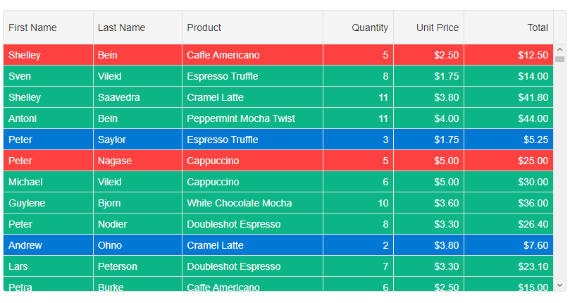
Row CSS Rules
By using Row CSS rules, you can dynamically apply CSS classes to rows depending on your application requirements. The settings object contains the following properties: index, data, row, api.
rowCSSRules: {
	'cell-class-1': settings => settings.data.quantity === 5,
	'cell-class-2': settings => settings.data.quantity < 5,
	'cell-class-3': settings => settings.data.quantity > 5
}
The CSS classes are:
.cell-class-1{
	background: #FF4240;
	color: white;
}
.cell-class-2 {
	background: #0179D4;
	color: white;
}
.cell-class-3 {
	background: #0BB585;
	color: white;
}
For AI tooling
Developer Quick Reference
Topic: grid-styling-rows Component: Grid Framework: Angular
Main methods: setRowStyle(), highlightRow()
Common config keys: behavior, dataSource, editing, selection, columns
Implementation Notes
Compatibility: Angular 17+ (standalone) API access pattern: @ViewChild(...) + this.component.method()
Lifecycle guidance: Bind inputs declaratively and call imperative API through @ViewChild in/after ngAfterViewInit.
Common pitfalls:
- Using @ViewChild API too early (before view init).
- Omitting standalone imports for Smart modules in @Component.imports.
- Type mismatches between configuration fields and template bindings.
Validation checklist:
- Ensure module import exists in standalone component imports array.
- Use typed @ViewChild(..., { read: ComponentType }).
- Call imperative methods after view initialization.