Grid for React
React version of this topic (compatible with React 19+). Keep the same configuration logic from JavaScript and pass it as component props.
What this topic covers: practical setup, the framework-specific API access pattern, and copy-adapt guidance for the examples in this page.
import React, { useMemo, useRef } from 'react';
import { Grid } from 'smart-webcomponents-react/grid';
import 'smart-webcomponents-react/source/styles/smart.default.css';

export default function App() {
  const componentRef = useRef(null);
  const componentProps = useMemo(() => ({
    // Copy this topic's JavaScript configuration here.
  }), []);

  return <Grid ref={componentRef} {...componentProps}></Grid>;
}
Use componentRef.current for API methods in this topic.
Row Styling
To style entire row you can use thesetRowStyle method, onRowClass function and the highlightRow method.
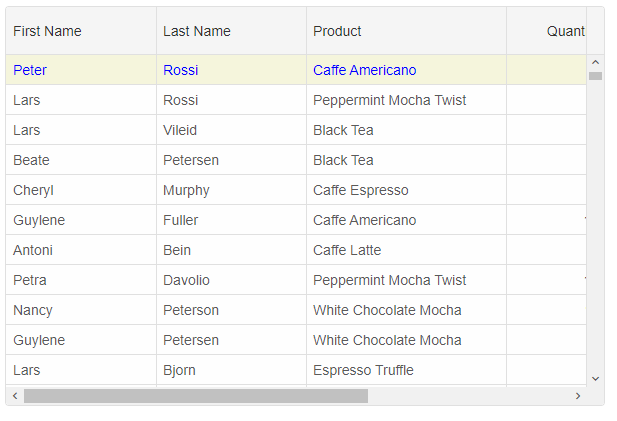
setRowStyle function
ThesetRowStyle method expects two arguments - rowID and rowStyle object. The rowStyle object may have one or all of the following properties: 'background', 'color', 'fontSize', 'fontFamily', 'textDecoration', 'fontStyle', 'fontWeight'.
componentRef.current.setRowStyle(0, {
	background: 'beige',
	color: 'blue'
});
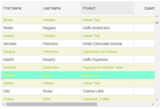
onRowClass function
Alternatively, by using theonRowClass function you can dynamically apply a CSS class(es) to an entire row. onRowClass should return a CSS class name string or an array of CSS class names divided by space.
.row-class-1{
	background: beige;
	color: yellowgreen;
}
.row-class-2 {
	background: aquamarine;
	color: yellow;
}
const componentProps = {
    behavior: { columnResizeMode: 'growAndShrink' },
    dataSource: new Smart.DataAdapter({
        dataSource: Data,
        dataFields: [
            'id: number',
            'firstName: string',
            'lastName: string',
            'productName: string',
            'quantity: number',
            'price: number',
            'total: number'
        ]
    }),
    editing: {
        enabled: true
    },
    selection: {
        enabled: true,
        allowCellSelection: true,
        allowRowHeaderSelection: true,
        allowColumnHeaderSelection: true,
        mode: 'extended'
    },
    onLoad: () => {
        componentRef.current.setRowStyle(0, {
            background: 'beige',
            color: 'blue'
        });
    },
    onRowClass(index, data, row) {
        if (index % 2 === 0) {
            return 'row-class-1'
        }
        if (data.firstName === 'Andrew') {
            return 'row-class-2';
        }
    },
    columns: [
        {
            label: 'First Name', width: 150, dataField: 'firstName'
        },
        { label: 'Last Name', width: 150, dataField: 'lastName' },
        { label: 'Product', width: 200, dataField: 'productName' },
        { label: 'Quantity', width: 100, dataField: 'quantity' },
        { label: 'Unit Price', width: 100, dataField: 'price', cellsFormat: 'c2' },
        { label: 'Total', dataField: 'total', width: 200, cellsFormat: 'c2' }
    ]
};
highlightRow function
To apply a CSS class to a row, you can also use thehighlightRow method.
componentRef.current.highlightRow(0, 'row-class-1')
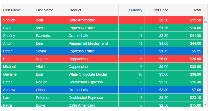
Row CSS Rules
By using Row CSS rules, you can dynamically apply CSS classes to rows depending on your application requirements. The settings object contains the following properties: index, data, row, api.
rowCSSRules: {
	'cell-class-1': settings => settings.data.quantity === 5,
	'cell-class-2': settings => settings.data.quantity < 5,
	'cell-class-3': settings => settings.data.quantity > 5
}
The CSS classes are:
.cell-class-1{
	background: #FF4240;
	color: white;
}
.cell-class-2 {
	background: #0179D4;
	color: white;
}
.cell-class-3 {
	background: #0BB585;
	color: white;
}
For AI tooling
Developer Quick Reference
Topic: grid-styling-rows Component: Grid Framework: React
Main methods: setRowStyle(), highlightRow()
Common config keys: behavior, dataSource, editing, selection, columns
Implementation Notes
Compatibility: React 19+ API access pattern: const componentRef = useRef(null) + componentRef.current.method()
Lifecycle guidance: Use useMemo for large config objects and call imperative API through componentRef.current after first render.
Common pitfalls:
- Recreating columns/dataSource objects on every render can reset component state.
- Calling API methods before ref is available causes runtime errors.
- Mixing controlled and imperative updates without sync can lead to stale UI.
Validation checklist:
- Keep config objects memoized when possible.
- Guard API calls with ref existence checks.
- Verify CSS theme import is present once per app.