Getting Started with Scheduler Web Component
Smart UI Web Components work with current evergreen browsers and Node 18+ for local tooling; pin package versions to match your project policy.
Smart UI is distributed as the smart-webcomponents NPM package. You can also use the full download from the Download page.
Quick start
- Install the package:
npm install smart-webcomponents
- Load the Scheduler module (ES module script):
<script type="module" src="node_modules/smart-webcomponents/source/modules/smart.scheduler.js"></script>
- Add the default stylesheet (prefer angular.json / bundler entry in app codebases; for plain HTML use a link):
<link rel="stylesheet" type="text/css" href="node_modules/smart-webcomponents/source/styles/smart.default.css" />
- Add markup in one of two ways - semantic custom element (the component tag is in your HTML) or a host
div(you mount programmatically with appendTo):
Semantic element (id matches the selector in Smart()):
<smart-scheduler id="scheduler"></smart-scheduler>
Host container (id matches appendTo on Smart.Scheduler):
<div id="schedulerContainer"></div>
- Initialize after the module loads: define a const schedulerOptions object, then either bind with Smart('#scheduler', ...) on the semantic tag or use new Smart.Scheduler({ ...schedulerOptions, appendTo: '#schedulerContainer' }) on the host
div:
<script type="module">
	import 'node_modules/smart-webcomponents/source/modules/smart.scheduler.js';

	const schedulerOptions = {};

	// Option A - semantic <smart-scheduler> with id="scheduler"
	Smart('#scheduler', class {
		get properties() {
			return schedulerOptions;
		}
	});

	// Option B - host div id="schedulerContainer"
	// const schedulerInstance = new Smart.Scheduler({
	// 	...schedulerOptions,
	// 	appendTo: '#schedulerContainer'
	// });

	// Option C - constructor(selector, options), then append the returned element yourself
	// const myScheduler = new Smart.Scheduler('#scheduler', schedulerOptions);
	// document.body.appendChild(myScheduler);
</script>
Uncomment Option B when you use the host
div; use Option A when you use the semantic element. The Runtime cookbook also documents new Smart.Scheduler('#scheduler', schedulerOptions) with appendChild, and document.createElement('smart-scheduler') with .props or Object.assign (all are valid patterns; do not combine overlapping patterns for the same instance unless you intend multiple components). - Serve the folder over HTTP (or use your bundler dev server) and open the page.
Runtime cookbook
Alternative creation patterns and imperative APIs. These are all valid ways to create Smart UI components: semantic markup + Smart(); new Smart.Scheduler({ ...options, appendTo: '#...' }); new Smart.Scheduler('#scheduler', schedulerOptions) plus appendChild on the returned element; and document.createElement('smart-scheduler') then assigning options via .props or Object.assign on the element.
Constructor with a selector string and options, then append the returned element (for example const myScheduler = new Smart.Scheduler('#scheduler', schedulerOptions)):
	const schedulerOptions = {};
	const myScheduler = new Smart.Scheduler('#scheduler', schedulerOptions);
	document.body.appendChild(myScheduler);
Create with document.createElement('smart-scheduler'), assign properties (same as any custom element), then append:
	const schedulerOptions = {};
	const scheduler = document.createElement('smart-scheduler');
	Object.assign(scheduler, schedulerOptions);
	document.body.appendChild(scheduler);
Host on a div with appendTo (import the module, then instantiate when the document is ready; the container id must match appendTo):
	import "../../source/modules/smart.scheduler.js";

	document.readyState === 'complete' ? init() : window.addEventListener('load', init);

	function init() {
		const schedulerOptions = {};
		const scheduler = new Smart.Scheduler({
			...schedulerOptions,
			appendTo: '#schedulerContainer'
		});
	}
DataSource
The dataSource property of the Smart.Scheduler allows to load an Array of Events. Each event is defined as an object with the following properties:
- label - the label for the Event. The label should be of type 'string'.
- dateStart - the starting date for the Event. The dateStart should be of type 'date' or 'string'.
- dateEnd - the ending date for the Event. The end date must not be the same as the start. The dateEnd should be of type 'date' or 'string'.
- description - the description of the Event. The description should be of type 'string'.
- id - the unique id of the Event. The id value is applied to the DOM element that represents the event. The id should be of type 'string'.
- class - the class of the Event. The class value is applied to the DOM element that represents the event. The class should be of type 'string'.
- backgroundColor - a custom background color for the Event. Optional. The color should be defined as a HEX value. The backgroundColor should be ot type 'string'.
- color - a custom color for the Event. Optional. The color should be defined as a HEX value. The color should be of type 'string'.
- notifications - an array of objects that define the notifications for the Event.
Notificaitons can appear on the same day as the event starts or before that.
- interval - a numeric interval that indicates the number of days/weeks on which the notification will appear before the event start date.
- type - the type of the interval. It can be 'days' or 'week'. By default it's days.
- time - an array of numbers that indicate the hours and minutes of the date on which the notificaiton should appear.
- allDay - a boolean property which indicates that the Event lasts all day and the Scheduler should ignore the time offset.
- disableDrag - a boolean property that disables the abbility to drag an Event.
- disableResize - a boolean property that disables the abbility to resize an Event.
- repeat - a repeat object that defines the repeating settings for the Event. Optional.
Repeating events have this property assigned. Here are it's attributes:
- repeatFreq - a string that represents the repeat frequency for the event, e.g. 'daily', 'weekly', etc.
- repeatInterval - a number that represents the repeat interval for the event.
- repeatOn - depending on the repeatFreq the event can repeat on specific days or date. The repeatOn value can be an array of numbers which indidate the days of the week for 'weekly' repeating frequency, a number which indicates the date of the month for 'monthly' repeating frequency or a date which indicates the date of the year when repeat frequency is set to 'yearly'.
- repeatEnd - the end condition for the repeating event. The event can end on a date or after a number of occurances. If not set the repeating event will never end.
- exceptions - an array of objects that define the event date exceptions for the repeating event. An exception can contain a different start/end date but it's date property must be equal to an expected repeating date. Exceptions can have different backgroundColor and color. They can also be hidden via the hidden attribute.
These are the Event attributes that Smart.Sheduler uses. Any other attributes added to the Event objects will be preserved but not used by the element.
Resources are assigned to the event object as key-value records. Where the key is the resource's value and value is the resource item id. Resources are described in depth in another topic on the website.
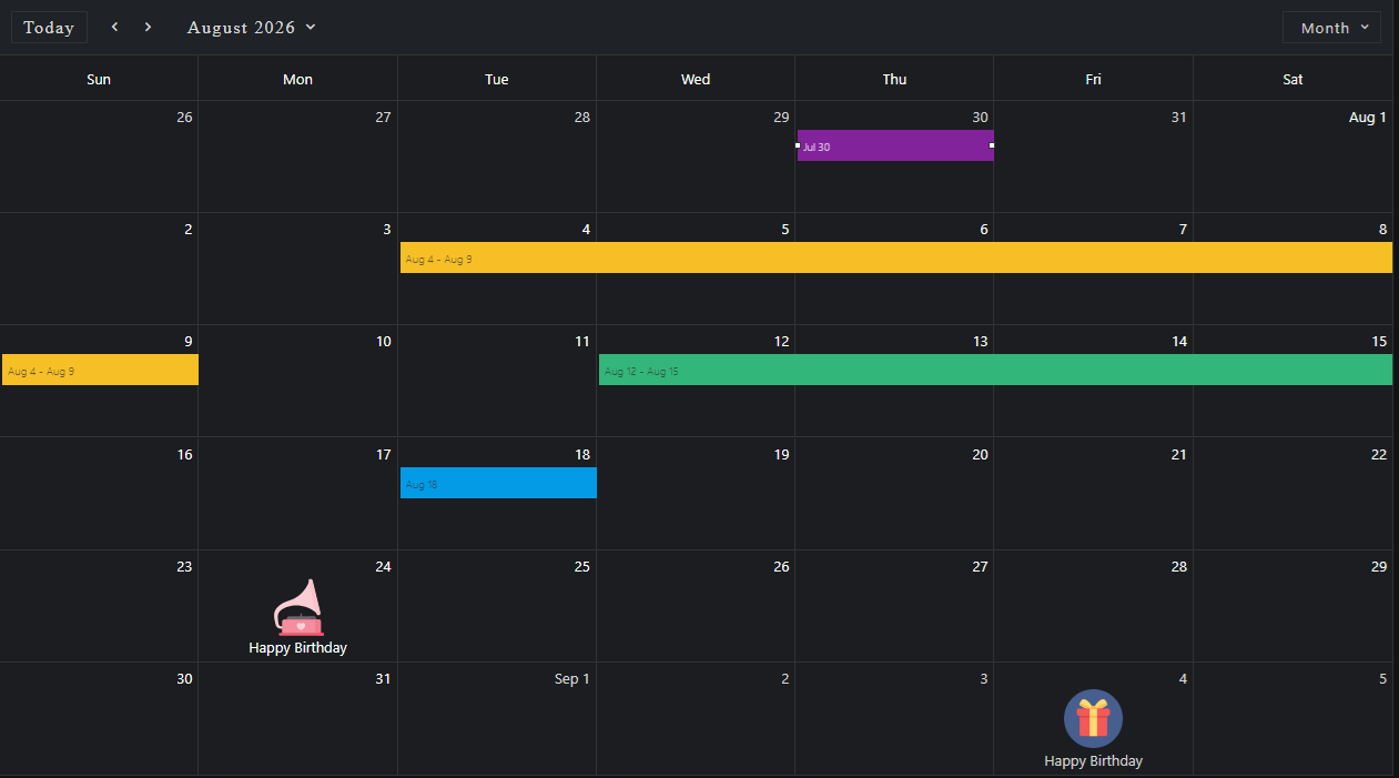
Here's an example of a Scheduler with three Events:
const today = new Date(),
    currentYear = today.getFullYear(),
    currentMonth = today.getMonth(),
    data = [
        {
            label: 'Event 1',
            dateStart: new Date(currentYear, currentMonth, 10),
            dateEnd: new Date(currentYear, currentMonth, 11)
        }, {
            label: 'Event 2',
            dateStart: new Date(currentYear, currentMonth, 11, 11, 30),
            dateEnd: new Date(currentYear, currentMonth, 11, 14, 15)
        }, {
            label: 'Event 3',
            dateStart: new Date(currentYear, currentMonth, 12, 13, 15),
            dateEnd: new Date(currentYear, currentMonth, 12, 16, 15)
        }
    ];

window.Smart('#scheduler', class {
    get properties() {
        return {
            //Properties
            view: 'week',
            dataSource: data
        };
    }
});
Demo

Resources
Smart.Scheduler resources can be used to assign Events to specific resources. They allow to specify the Events. Events can have one or many resources assigned to them.
Resources can have custom colors. The Scheduler can group events by one or more resources.
Resources property represents an Array of objects with the following properties:- label - a string that represents the label of the resource.
- value - a string that represents the unique value of the resource by which it can be identified from the rest.
- dataSource - an array that contains the items of the resource. Each item contains the
following properties:
- id - a number or string that acts as a unique identifier for the item.
- label - a string that represents the label of the resource item.
- backgroundColor - a string that represents the HEX representation of a color that will be used as the background color for the Events that have the resource item assigned.
- color - a string that represents the HEX representation of a color that will be used as the color for the Events that have the resource item assigned.
Here's an example:
const today = new Date(),
    currentYear = today.getFullYear(),
    currentMonth = today.getMonth(),
    data = [
        {
            label: 'Event 1',
            dateStart: new Date(currentYear, currentMonth, 10),
            dateEnd: new Date(currentYear, currentMonth, 11),
            priorityId: 1
        }, {
            label: 'Event 2',
            dateStart: new Date(currentYear, currentMonth, 11, 11, 30),
            dateEnd: new Date(currentYear, currentMonth, 11, 14, 15),
            priorityId: 2
        }, {
            label: 'Event 3',
            dateStart: new Date(currentYear, currentMonth, 12, 13, 15),
            dateEnd: new Date(currentYear, currentMonth, 12, 16, 15),
            priorityId: 1
        }
    ];

const priorityData = [
    {
        label: 'Low Priority',
        id: 1,
        backgroundColor: '#1e90ff'
    }, {
        label: 'Medium Priority',
        id: 2,
        backgroundColor: '#ff9747'
    }
];

Smart('#scheduler', class {
    get properties() {
        return {
            //Properties
            view: 'week',
            dataSource: data,
            resources: [
                {
                    label: 'Priority',
                    value: 'priorityId',
                    dataSource: priorityData
                }
            ]
        };
    }
});
Here we have a single resource with identifier 'priorityId' that contains two priorities : 'low' and 'medium'. Each of them has individual color.
The resources items are assigned to the Events using their 'value' directly set to the Event objects where the 'key' is the resources value while the 'value' is the resource item id.
Demo

Groups
Scheduler Events can be grouped by Resources. When groups property is set Events that do not have a resource assigned to them or the groups property does not include their resource will not be displayed.
The groups property accepts an array of strings which represent resource values.
Here's an example of grouping by a single resource that has two items.
Smart('#scheduler', class {
    get properties() {
        return {
            //Properties
            view: 'week',
            dataSource: data,
            resources: [
                {
                    label: 'Priority',
                    value: 'priorityId',
                    dataSource: priorityData
                }
            ],
            groups: ['priorityId']
        };
    }
});
The timeline view of the Scheduler is separated into multiple sections for each group and the events are positioned according to their dates.
Demo

Smart.Scheduler is virtualized by default and does not have a limit on the groups, events or resources count.
Scheduler also allows to group events by Date in addition to Resources grouping. In order to group by date simply set the groupByDate property like so:
Smart('#scheduler', class {
    get properties() {
        return {
            //Properties
            view: 'week',
            dataSource: data,
            resources: [
                {
                    label: 'Priority',
                    value: 'priorityId',
                    dataSource: priorityData
                }
            ],
            groups: ['priorityId'],
            groupByDate: true
        };
    }
});
Demo

The Events are grouped by date by separating each Date cell into the number of resource groups.
Event Editor
A Smart.Window component is available for Event editing inside the Scheduler. In order to open the editor the user simply has to double click on an event element or press the 'Enter' key when the event element is focused.
The window will appear in the middle of the Scheduler and will allow the user to modify all of the settings of the Event.
Creating new Events is also possible via the Window. When the user double clicks on a timeline cell or presses the 'Enter' key on focused cell the Event window editor will appear to create the new Event.
Here's an example:
Demo

The Scheduler window is modal so interaction with the Scheduler while the window is opened is disabled.
Event repeating options are avaialble when the "Repeat" switch button is on. The window will expand an additional panel with all repeating options allowing the user to create/customize the repeating series.

Clicking on the OK button will apply the editing changes to the event.
A 'confirm' window is the second type of window that can be opened inside the Smart.Scheduler. Confirm window appears when the user tries to edit a repeating event. This window prompts the user to select between editing the original repeating series or create a repeating exception from the target event. Repeating exceptions can have different start/end dates. They correspond to a specific repeating date of the original repeating series. Exceptions unlike other events cannot repeat but can be hidden via the edit window. This is useful in a scenario when, for example the user wants to create a repeating event for each day of the week but has to skip a day. Making the desired day as an exception and applying hidden will remove it form the repeating series. Repeating events and exceptions are covered in a separate topic.
Here's what the Confirm window looks like:

Time Zones
Smart.Scheduler allows to display additional Time zones at the same time thanks to the timeZones property which accepts an Array of strings which represent valid IANA timezone names. This allows the user to see the corresponding time for the events in multiple Time zones at once.
Here's an example of Smart.Scheduler with three Time zones visible:
const scheduler = document.querySelector('smart-scheduler');

scheduler.timeZones = [{ id: 'America/Chicago', label: 'US/Chicago' }, 'UTC'];
The default Time zone of the Smart.Scheduler is the local time zone. Setting the timeZones property displays additional time zones. In the example above the additional time zones include 'America/Chicago' and 'UTC'.
Here's what the Scheduler looks like:

The default Smart.Scheduler Time zone can also be changed via the timeZone property. By default it does not have a label inside the timeline header.
Menus
Smart.Scheduler contains many popup menus with different actions. These menu's allow to the change the view/date or create/ edit an event. Here's a list of the menus that are used by the Scheduler:
- Event Menu - appears when an event is clicked. It shows details about the event like start/end
date and label. Also allows to quickly delete the event via a delete button. The delete button
is available only on non-repeating events or exceptions.

- Context Menu - appears when the user right clicks on a view cell or an event. The context menu
allows to quickly create/delete and event.

- Date Menu - appears when the user clicks on the Date Selector located inside the Header of the
Smart.Scheduler. It allows to change the current view date.

- View Menu - appears when the user clicks on the View Selector located inside the Header of the
Smart.Scheduler. It allows to change the current view.

All Scheduler menus are customizable.
Save/Load State
Smart.Scheduler utilizes the localStorage by allowing to save the current state of the events and load it again at a later point. This is usefull when the user is going to make changes to the events and wants to have a step by step history of the changes. Smart.Scheduler state represents an object that contains the current viewing date and a JSON Array of Events that were loaded to the Scheduler at the time it was saved.
The following methods are available for Smart.Scheduler state handling:
- getState - returns an object containing the viewing date and a JSON Array of the Scheduler Events.
- saveState - saves the current state of the Scheduler to localStorage. Requires an ID to be set to the element.
- loadState - loads a previously saved state of the element. Accepts one argument - the state to load to. If no arguments are provided, localStorage lookup will be performed in order to find a previously saved state according to the id of the element. Requires an ID to be set to the element.
- clearState - removes any stored state in localStorage of the element according to it's id. Requires an ID to be set to the element.
 const scheduler = document.querySelector('smart-scheduler');

//Saves the current state of the Scheduler to localStorage
scheduler.saveState();

//Reload the element to the previously saved state
scheduler.loadState();

//Clears the saved state
scheduler.clearState();
Keyboard Support
Smart.Scheduler implements the following key actions:
| Key | Action |
|---|---|
| Escape | When dragging/resizing pressing the 'Escape' key will cancel the ongoing operation and return the target event to it's original state. The 'Escape' key can also close the Scheduler Windows and Menus if focused. |
| Tab | Pressing Tab will change the focus to another focusable element. Smart.Scheduler has many focusable elements - the date,view selectors, the events inside the Timeline, the Timeline itself wihch allows to navigate through the cells, the Scheduler Window and it's editors, the Event/cell menu. |
| Arrow Up/Down/Left/Right | When the Scheduler Timeline is focused these keys allow to navigate through the cells by selecting them. |
| Shift + Arrow Up/Down/Left/Right | When the Scheduler Timeline is focused the Shift + Arrow combination allows to create a range selection of multiple cells in the direciton of the arrow pressed. |
| Shift + Mouse Left Click | If a cell is selected, pressing Shift + Mouse Click on another cell allows to create a range selection from the initialy selected cell to the click target. |
| Enter | Allows to open one of the Menus/Windows of the Smart.Scheduler. This can happen if an event or cell, or date/view selector is currently focused. If multiple cells are selected pressing Enter will open the Window to create a new event from the selection range. |
| Delete | When an Event is focused this key allows to remove the Event form the Smart.Scheduler. The action can be canceled. Check the API of the element on the website for more details. |
| D | The default shortcut key for the 'Day' view. When the view selector is focused, pressing this key will change the view to 'Day'. This shortcut can be customized. Check the API on the website for more details. |
| W | The default shortcut key for the 'Week' view. When the view selector is focused, pressing this key will change the view to 'Week'. This shortcut can be customized. Check the API on the website for more details. |
| M | The default shortcut key for the 'Month' view. When the view selector is focused, pressing this key will change the view to 'Month'. This shortcut can be customized. Check the API on the website for more details. |
| A | The default shortcut key for the 'Agenda' view. When the view selector is focused, pressing this key will change the view to 'Agenda'. This shortcut can be customized. Check the API on the website for more details. |
| T + D | The default shortcut key combination for the 'Timeline Day' view. When the view selector is focused, pressing this key combo will change the view to 'Timeline Day'. This shortcut can be customized. Check the API on the website for more details. |
| T + W | The default shortcut key combination for the 'Timeline Week' view. When the view selector is focused, pressing this key combo will change the view to 'Timeline Week'. This shortcut can be customized. Check the API on the website for details. |
| T + W | The default shortcut key combination for the 'Timeline Month' view. When the view selector is focused, pressing this key combo will change the view to 'Timeline Month'. This shortcut can be customized. Check the API on the website for details. |
Append to the DOM:
const container = document.getElementById('scheduler-container');
container.appendChild(scheduler);
Remove from the DOM:
scheduler.remove();
Set a property:
scheduler.disabled = true;
scheduler.theme = 'dark';
Get a property value:
const isDisabled = scheduler.disabled;
const currentTheme = scheduler.theme;
Invoke a method:
scheduler.refresh();
scheduler.focus();
Add event listener:
scheduler.addEventListener('change', (event) => {
    console.log('change triggered:', event.detail.value);
});
Remove event listener:
const handleSchedulerEvent = (event) => {
    console.log('change triggered:', event.detail.value);
};

scheduler.addEventListener('change', handleSchedulerEvent);
scheduler.removeEventListener('change', handleSchedulerEvent);
Common Use Cases
-
Add a new event
Programmatically create a calendar event
scheduler.addEvent({ label: 'Meeting', dateStart: new Date(2026, 4, 15, 10, 0), dateEnd: new Date(2026, 4, 15, 11, 0) }); -
Change view mode
Switch between day, week, and month views
scheduler.view = 'month';
-
Handle event click
Respond when user clicks on an event
scheduler.addEventListener('itemClick', (e) => {
  console.log('Event clicked:', e.detail.item);
});
Troubleshooting
- How do I load events from an API?
- Fetch your data and assign it to scheduler.dataSource. Each event needs dateStart, dateEnd, and label properties at minimum.
- How do I prevent event editing?
- Set scheduler.disableEdit = true to prevent users from modifying events.
- How do I change the first day of the week?
- Set scheduler.firstDayOfWeek to the desired day (0 = Sunday, 1 = Monday, etc.).
Accessibility
The Scheduler component follows WAI-ARIA best practices:
- Keyboard navigation - Tab, Arrow keys, Enter, and Escape are supported
- ARIA roles - Appropriate roles and labels are applied automatically
- Focus management - Visible focus indicators for keyboard users
- Screen readers - State changes are announced to assistive technology
- High contrast - Supports Windows High Contrast Mode and forced colors
For custom labeling, set aria-label or aria-labelledby attributes on the component.
Supported stacks: Smart UI targets Angular 17+, React 18+, Vue 3+, Node 18 LTS, and evergreen browsers; pin exact package versions to your org policy.