Getting Started with React Chart Component
Smart UI React targets React 18+ and current Node LTS for tooling; use TypeScript templates when you want typed props and events.
Demo source (Smart UI repo): react/source/chart/overview/App.jsx
1 Create a Vite + React + TypeScript app
npm create vite@latest my-smart-app -- --template react-ts
cd my-smart-app
thennpm install
2 Install Smart UI for React
npm install smart-webcomponents-react
3 Import styles and render the component
Open src/App.tsx (or App.jsx if you chose JavaScript). The snippet below matches Smart UI React demos for this widget:
import 'smart-webcomponents-react/source/styles/smart.default.css';
import './App.css';
import React from 'react';
import { Chart } from 'smart-webcomponents-react/chart';
const App = () => {
const caption = 'Fitness & Exercise Weekly Scorecard';
const description = 'Time spent in vigorous exercise by activity';
const showLegend = true;
const padding = {
left: 10,
top: 10,
right: 15,
bottom: 10
};
const titlePadding = {
left: 90,
top: 0,
right: 0,
bottom: 10
};
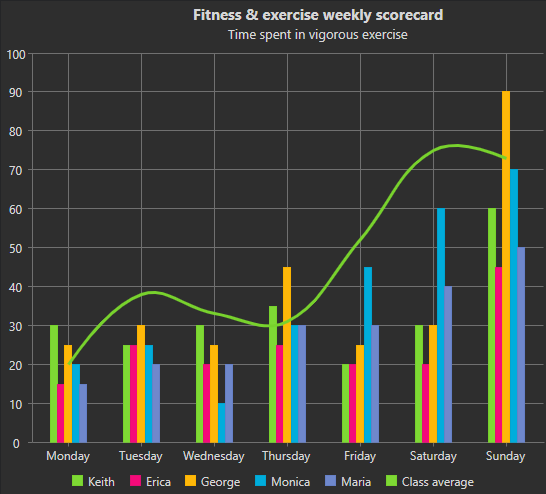
const dataSource = [
{ Day: 'Monday', Running: 30, Swimming: 10, Cycling: 25, Goal: 40 },
{ Day: 'Tuesday', Running: 25, Swimming: 15, Cycling: 10, Goal: 50 },
{ Day: 'Wednesday', Running: 30, Swimming: 10, Cycling: 25, Goal: 60 },
{ Day: 'Thursday', Running: 40, Swimming: 20, Cycling: 25, Goal: 40 },
{ Day: 'Friday', Running: 45, Swimming: 20, Cycling: 25, Goal: 50 },
{ Day: 'Saturday', Running: 30, Swimming: 20, Cycling: 30, Goal: 60 },
{ Day: 'Sunday', Running: 20, Swimming: 30, Cycling: 10, Goal: 90 }
];
const colorScheme = 'scheme13';
const xAxis = {
dataField: 'Day',
unitInterval: 2,
tickMarks: { visible: true, unitInterval: 1 },
gridLines: { visible: true, unitInterval: 1 },
valuesOnTicks: false,
padding: { bottom: 10 }
};
const valueAxis = {
unitInterval: 10,
minValue: 0,
maxValue: 50,
title: { text: 'Time in minutes<br><br>' },
labels: { horizontalAlignment: 'right' }
};
const labelStyle = {
visible: true,
backgroundColor: '#FEFEFE',
backgroundOpacity: 0.2,
borderColor: '#7FC4EF',
borderOpacity: 0.7,
padding: { left: 5, right: 5, top: 0, bottom: 0 }
};
const seriesGroups = [
{
type: 'spline',
series: [
{ dataField: 'Swimming', symbolType: 'square', labels: labelStyle },
{ dataField: 'Running', symbolType: 'square', labels: labelStyle }
]
}
];
return (
<div className="App">
<Chart
id="chart"
caption={caption}
description={description}
showLegend={showLegend}
padding={padding}
titlePadding={titlePadding}
dataSource={dataSource}
colorScheme={colorScheme}
xAxis={xAxis}
valueAxis={valueAxis}
seriesGroups={seriesGroups}
/>
</div>
);
};
export default App;
4 Run the dev server
npm run dev
Open the URL Vite prints (often http://localhost:5173/).
Common Use Cases
-
Update chart data dynamically
Refresh chart with new data points
chart.dataSource = newDataArray;
chart.refresh();
-
Change chart type
Switch between chart types like line, bar, pie
chart.seriesGroups[0].type = 'column';
chart.refresh();
-
Export chart as image
Save the chart as a PNG or JPEG file
chart.saveAsImage('chart.png', 'image/png');
Troubleshooting
- Why is my chart blank?
- Verify dataSource contains data and seriesGroups are configured with valid dataField references matching your data keys.
- How do I update chart data dynamically?
- Reassign the dataSource property and call chart.refresh() to redraw with new data.
- How do I change the chart colors?
- Set the colorScheme property (e.g., 'scheme01' to 'scheme32') or define custom colors in seriesGroups series configuration.
TypeScript Support
Types ship with smart-webcomponents-react. Import the component and prop types:
import type { Chart, ChartProps } from 'smart-webcomponents-react/chart';
The generated wrappers expose on* callbacks (for example onChange) whose arguments are standard DOM Event values unless the widget typings narrow them further.
Accessibility
The Chart component follows WAI-ARIA best practices:
- Keyboard navigation - Tab, Arrow keys, Enter, and Escape are supported
- ARIA roles - Appropriate roles and labels are applied automatically
- Focus management - Visible focus indicators for keyboard users
- Screen readers - State changes are announced to assistive technology
- High contrast - Supports Windows High Contrast Mode and forced colors
For custom labeling, set aria-label or aria-labelledby attributes on the component.
Supported stacks: Smart UI targets Angular 17+, React 18+, Vue 3+, Node 18 LTS, and evergreen browsers; pin exact package versions to your org policy.