Getting Started with React PivotTable Component
Smart UI React targets React 18+ and current Node LTS for tooling; use TypeScript templates when you want typed props and events.
Demo source (Smart UI repo): react/source/pivottable/basic/App.jsx
1 Create a Vite + React + TypeScript app
npm create vite@latest my-smart-app -- --template react-ts
cd my-smart-app
thennpm install
2 Install Smart UI for React
npm install smart-webcomponents-react
3 Import styles and render the component
Open src/App.tsx (or App.jsx if you chose JavaScript). The snippet below matches Smart UI React demos for this widget:
import 'smart-webcomponents-react/source/styles/smart.default.css';
import React from "react";
import ReactDOM from 'react-dom/client';
import { PivotTable } from 'smart-webcomponents-react/pivottable';
import { GetData } from './common/data';

const App = () => {
	const dataSourceSettings = {
		dataFields: [
			'firstName: string',
			'lastName: string',
			'productName: string',
			'quantity: number',
			'price: number',
			'date: date'
		]
	};

	const dataSource = GetData(50);
	const freezeHeader = true;
	const grandTotal = true;
	const keyboardNavigation = true;
	const columns = [{
		label: 'First Name',
		dataField: 'firstName',
		dataType: 'string'
	},
	{
		label: 'Last Name',
		dataField: 'lastName',
		dataType: 'string',
		allowRowGroup: true,
		rowGroup: true
	},
	{
		label: 'Product Name',
		dataField: 'productName',
		dataType: 'string',
		allowPivot: true,
		pivot: true
	},
	{
		label: 'Quantity',
		dataField: 'quantity',
		dataType: 'number',
		summary: 'sum'
	},
	{
		label: 'Price',
		dataField: 'price',
		dataType: 'number',
		summary: 'sum',
		summarySettings: {
			prefix: '$',
			decimalPlaces: 2
		}
	},
	{
		label: 'Date Purchased',
		dataField: 'date',
		dataType: 'date'
	} // column is not rendered, because it is neither "pivot", "rowGroup", nor it has "summary"
	];

	return (
		<div>
			<div className="demo-description">This demo showcases the basic functionality of PivotTable - a table of
				statistics that summarizes tabular data.</div>
			<PivotTable id="pivotTable"
				dataSourceSettings={dataSourceSettings}
				dataSource={dataSource}
				freezeHeader={freezeHeader}
				grandTotal={grandTotal}
				keyboardNavigation={keyboardNavigation}
				columns={columns}>
			</PivotTable>
		</div>
	);
}


export default App;
4 Run the dev server
npm run dev
Open the URL Vite prints (often http://localhost:5173/).
TypeScript Support
Types ship with smart-webcomponents-react. Import the component and prop types:
import type { PivotTable, PivotTableProps } from 'smart-webcomponents-react/pivottable';
The generated wrappers expose on* callbacks (for example onChange) whose arguments are standard DOM Event values unless the widget typings narrow them further.
Pivot Table Concepts, Columns, and Column Roles
Smart.PivotTable is a table of statistics that summarizes the data of a more extensive table (such as from a database, spreadsheet, or business intelligence program). This summary might include sums, averages, or other statistics, which the pivot table groups together in a meaningful way. The PivotTable arranges and rearranges (or "pivots") statistics in order to draw attention to useful information.
PivotTable has two types of columns - the original columns, that correspond to the ones from the grid/table/database the data is retrieved from, and the dynamic columns which are the columns visible in the PivotTable after the data has been processed.
Original Columns
The original columns are defined in the PivotTable's settings by setting the columns property. Here is a sample configuration:
columns: [
    { label: 'Last Name', dataField: 'lastName', dataType: 'string', allowRowGroup: true, rowGroup: true },
    { label: 'First Name', dataField: 'firstName', dataType: 'string', allowRowGroup: true, rowGroup: true },
    { label: 'Product Name', dataField: 'productName', dataType: 'string', allowPivot: true, pivot: true },
    { label: 'Quantity', dataField: 'quantity', dataType: 'number', summary: 'sum' },
    { label: 'Price', dataField: 'price', dataType: 'number', summary: 'sum', summarySettings: { prefix: '$', decimalPlaces: 2 } }
]
To be visualized in the PivotTable, a column has to have at least one role, configured by setting one of the properties:
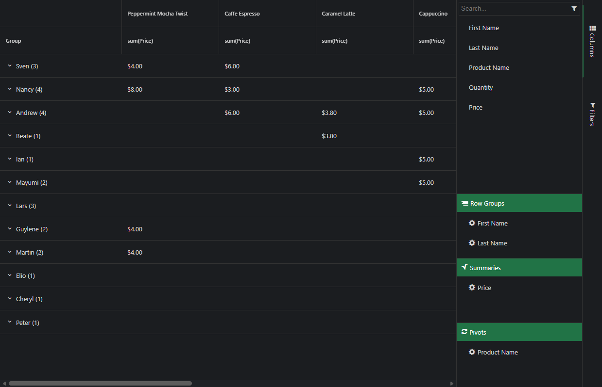
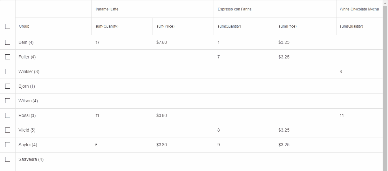
- pivot - data from pivot columns is represented as column hierarchy in the PivotTable (see image below - (1)). Whether or not a column can be a pivot column is determined by allowPivot. Pivot columns are optional.
- rowGroup - data from row group columns is represented as rows in the PivotTable (see image below - (2)). Whether a column can be a row group column is determined by allowRowGroup. Row group columns are optional.
- summary - determines the summary function to aggregate the column's data by and produce
dynamic summary columns for each unique pivot data point. There must always be at least one
summary column for the PivotTable to make sense (see image below - (3)). Possible summary
functions are:
- avg - Average
- count - Count
- max - Maximum
- median - Median
- min - Minimum
- product - Product
- stdev - Standard deviation
- stdevp - Standard deviation based on the entire population
- sum - Sum
- var - Variance
- varp - Variance based on the entire population
Dynamic Columns
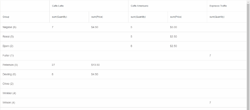
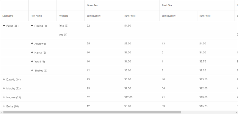
Once the PivotTable's data source and original columns array are processed, dynamic columns with summarized data are produced and populated. Here is an image that shows a Smart.PivotTable with dynamic columns based on the columns array from above:
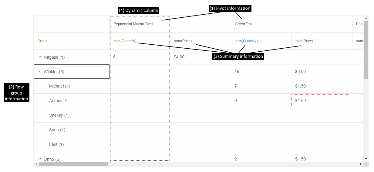
The cell highlighted in red in the image shows the sum of the prices (summary (3)) of all products Green Tea (pivot (1)), purchased by everyone named Antony Winkler (rowGroup (2)).
There can be multiple pivot, row group, and summary columns. The order in which they appear in the PivotTable depends on the order in which they are configured in the columns array. That is why, in this case, rows are first grouped by Last Name, then by First Name and sum(Quantity) is before sum(Price).
Information about all currently displayed dynamic columns can be retrieved by calling the method getDynamicColumns.
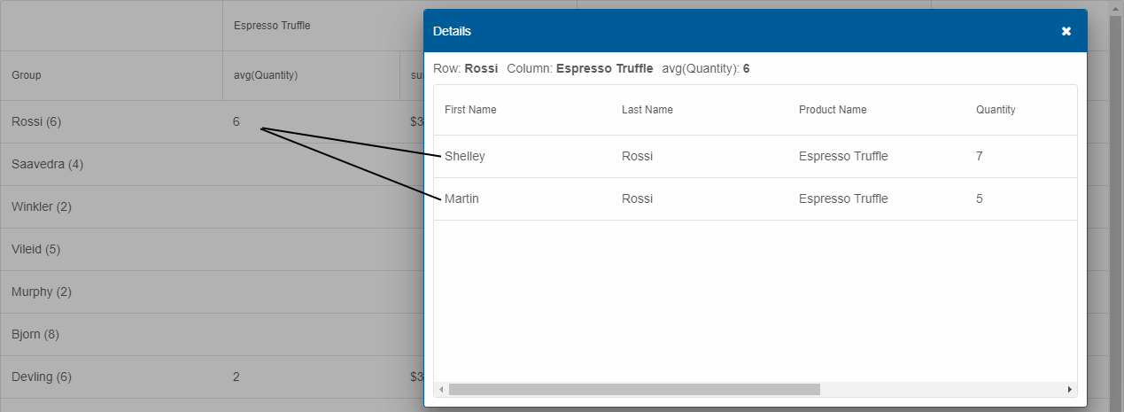
Drill Down
Each cell in PivotTable may summarize one or more original data points. If the property drillDown is enabled, the user can double-click a cell to show a Smart.Table in a dialog with all records aggregated in the clicked PivotTable cell.
Pivot Table Operations
A variety of operations can be performed on Smart.PivotTable's aggregated data or dynamic columns. Here is an overview:
Column Reorder
Dynamic columns can be reordered by clicking a summary header and dragging with the mouse. Reorder is enabled by setting the columnReorder property to true.
Data Export
The PivotTable's data can be exported to a wide variety of file formats:
- CSV
- HTML
- JSON (depends on the external free plug-in JSZip)
- PDF (depends on the external free plug-in PDFMake)
- TSV
- XLSX
- XML
by calling the element's method exportData, e.g.:
const pivotTable = document.getElementById('pivotTable');
pivotTable.exportData('html', 'pivotTable');
This sample code exports the PivotTable to the file pivotTable.html.
Filtering
The original data bound to Smart.PivotTable can be filtered in order to summarize a more focused set of data points. Filtering can be applied in two ways:
- Programmatically by calling the method addFilter. Related methods are removeFilter and clearFilters.
- Via the "Filters" panel of the PivotTable's designer. It can be displayed as a stand-alone part of the element by setting designer to true or can be opened in a dialog by clicking the "Fields" button of the PivotTable's toolbar. The designer is described in detail in the help topic Pivot Table Toolbar, Designer, and Settings.
Selection
Checkbox row selection can be enabled in Smart.PivotTable by setting the property selection to true. There are two selection modes available:
- selectionMode: 'many' (default) - multiple rows can be selected by clicking the rows or their respective checkboxes.
- selectionMode: 'extended' - single row can be selected by clicking it. Multiple rows can be selected by Ctrl- or Shift-clicking the rows or just clicking their respective checkboxes.
Sorting
The PivotTable can be sorted by its dynamic columns (including the Group column). The sorting behavior is controlled by the property sortMode with the following values:
- 'none' (default) - sorting is disabled.
- 'one' - sorting by one column only is enabled.
- 'many' - sorting by multiple columns is enabled.
Users can apply sorting by clicking on a column's summary header. Clicking multiple times toggles between ascending direction, descending direction, and no sorting.
Alternatively, sorting can be modified with the methods sortBy and clearSort.
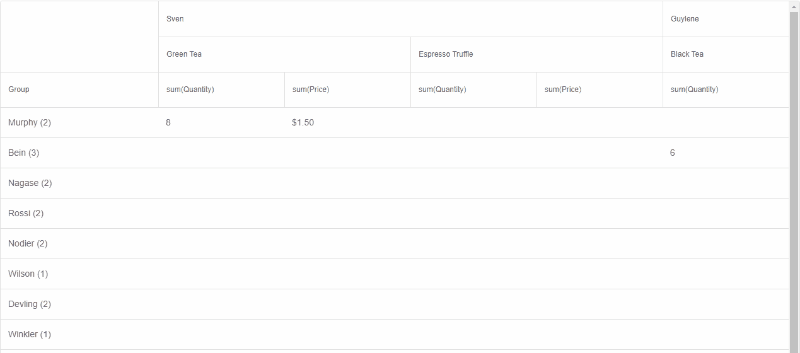
Classic Layout
When there are row group columns in the PivotTable, an alternative layout, inspired by classic, OLAP, pivot tables can be enabled. In this layout, there is a separate column for each level of nesting (row group applied) as opposed to the default, tree grid-like, style with a separate row for each record in the hierarchy. Moreover, in classic layout, the data shown in a table row depends on whether the row is collapsed ("parent" data) or expanded (first "child" data).
The classic, OLAP, layout can be enabled by setting the property groupLayout to 'classic':
Advanced Features
Additional, advanced, features of Smart.PivotTable are described in the following help topics:
Methods
Smart.PivotTable has the following methods:
- addFilter(dataField, filter) - adds a filter to a specific column.
- clearFilters() - clears applied filters.
- clearSelection() - clears selection.
- clearSort() - clears the PivotTable sorting.
- collapseAllRows() - collapses all rows (when multiple row groups are applied).
- collapseRow(rowId) - collapses a row (when multiple row groups are applied).
- expandAllRows() - expands all rows (when multiple row groups are applied).
- expandRow(rowId) - expands a row (when multiple row groups are applied).
- exportData(dataFormat, fileName, callback) - exports the PivotTable's data.
- getDynamicColumns() - returns the current dynamic pivot columns.
- getSelection() - returns an array of selected row ids.
- refresh() - refreshes the PivotTable.
- removeFilter(dataField) - removes filters applied to a specific column.
- select(rowId) - selects a row.
- sortBy(columnDefinition,sortOrder) - sorts by a summary or group column.
- unselect(rowId) - unselects a row.
Accessibility
The PivotTable component follows WAI-ARIA best practices:
- Keyboard navigation - Tab, Arrow keys, Enter, and Escape are supported
- ARIA roles - Appropriate roles and labels are applied automatically
- Focus management - Visible focus indicators for keyboard users
- Screen readers - State changes are announced to assistive technology
- High contrast - Supports Windows High Contrast Mode and forced colors
For custom labeling, set aria-label or aria-labelledby attributes on the component.
Supported stacks: Smart UI targets Angular 17+, React 18+, Vue 3+, Node 18 LTS, and evergreen browsers; pin exact package versions to your org policy.